
With the rise of online search via Google and Amazon, app users today expect forms and menus to be easy and fast to fill out—often with autocomplete suggestions.

So if you're building a React project for a modern web app, autocomplete has become an essential feature. Luckily, you can use an autocomplete library instead of writing code from scratch.
We’ve researched and compared React autocomplete libraries to suss out the best React autocomplete library, and then created this simple guide to aggregate all the top options in one place.
After trying out a handful of libraries, we think your go-to React autocomplete library should be Downshift because of its simplicity, flexibility, and accessibility.
Why Downshift Is the Best React Autocomplete Library
Downshift is not only popular but also fast, simple, flexible, and accessible because of two design decisions—using a render callback and using controlled props—that set it apart from other React autocomplete library solutions.
We particularly appreciate that Downshift designer, Kent C. Dodds, thoroughly explains his design thinking.
Because there are a few good options when choosing an autocomplete library, it’s good to have context about Downshift and its competitors. Downshift is the second most popular React autocomplete library according to npm trends and gets 2 million weekly downloads according to Openbase.
Aside from its popularity, there are specific choices Dodds made when creating Downshift that resulted in its utility.
The first design decision is that Downshift uses a render callback to render whatever you want inside <Downshift />. Unlike with other libraries, this allows you to fully control when, where, and how you render the selectable items in your menu, Dodds explains. You don’t have to learn or work with any APIs because Downshift isn’t rendering your menu or your items.
Second, Downshift uses controlled props. Using controlled props allows you to have “complete control over the state of your component,” according to Dodds.
Reactjs.org explains:
With a controlled component, the input’s value is always driven by the React state. While this means you have to type a bit more code, you can now pass the value to other UI elements too, or reset it from other event handlers.
You can watch Ryan Florence teach more about controllable components in this lesson that Dodds recommends.
In comparing libraries, we found in personal usage—and Dodds reports in his own survey—that Downshift is the most accessible React autocomplete library for people with impaired vision.
Downshift works well with Apple’s VoiceOver so that users can read what’s on the screen. You can even watch Kent C. Dodds work to make Downshift have better accessibility. It’s nice to know the creator of the library cares so much about accessibility!
On top of everything else, Downshift is a small download and won’t slow down your project. Downshift is the smallest React autocomplete library with a UMD build of only 14.34kb.
Other Popular React Autocomplete Libraries
Using npm trends, we also collected the most popular React autocomplete libraries by downloads. Let’s walk through three popular alternatives to Downshift and give you some pros and cons for each.

Source: npmtrends.com
react-select is the most popular React autocomplete library, although Downshift has been gaining ground in the last year. We’ve found that react-select’s documentation isn’t as extensive or helpful as Downshift’s. That said, react-select is an open-source project funded by Thinkmill and Atlassian that’s actively developing the library. Although v1 had some limitations, v2 solved a lot of them.
We should also mention react-autosuggest, which is a “just fine” autocomplete library. react-autosuggest prides itself on being “mobile friendly,” which we found was definitely the case.
Unfortunately, however, according to Openbase, the project is no longer in active development. That means that if you run into a problem in the library’s code, its developers won’t provide new solutions. One major advantage of react-autosuggest is that its package is only 9kb, smaller than even Downshift.
react-bootstrap-typeahead is another React autocomplete library, although it’s not as popular as the other options we discuss and has significant drawbacks. react-bootstrap-typeahead is based on Bootstrap for styling and behaviors and was originally based on Twitter’s typeahead.js. Its one major advantage is that it supports both single and multi-selection. However, this library requires additional styling and the installation of an extra CSS file in your project.
Use react-select as Your Runner-Up Option
If you’re not going to use Downshift, we recommend using react-select because of its popularity, active development, and documentation.
Longevity is crucial—you don’t want the React libraries you use to become obsolete. But you don’t need to worry about that with react-select. As we mentioned above, the react-select autocomplete library is in active development and backed by big names, so it’s not going away anytime soon.
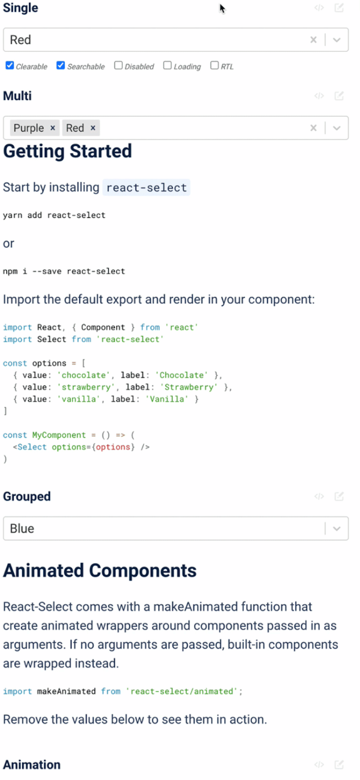
Although we prefer Downshift’s documentation, react-select’s website features good documentation and useful interactive examples. In the interactive examples, you can “see the source or open the examples on codesandbox using the buttons that appear when you hover over each select.”
Here’s an example:
The library’s creator, Jed Watson, gave an awesome talk about how he “accidentally” created react-select, which provides further context around the library and the tribulations that went into building it. If you want to dive deep into the origins of your React autocomplete library, spend half an hour on YouTube with Jed.
Downshift Is the Right React Autocomplete Library for Most Use Cases
If you’re choosing between React autocomplete libraries, Downshift should be your choice. Although it’s not the most popular in terms of sheer downloads, Downshift is the most simple and flexible solution, has the best documentation, and is the most accessible for people with disabilities.