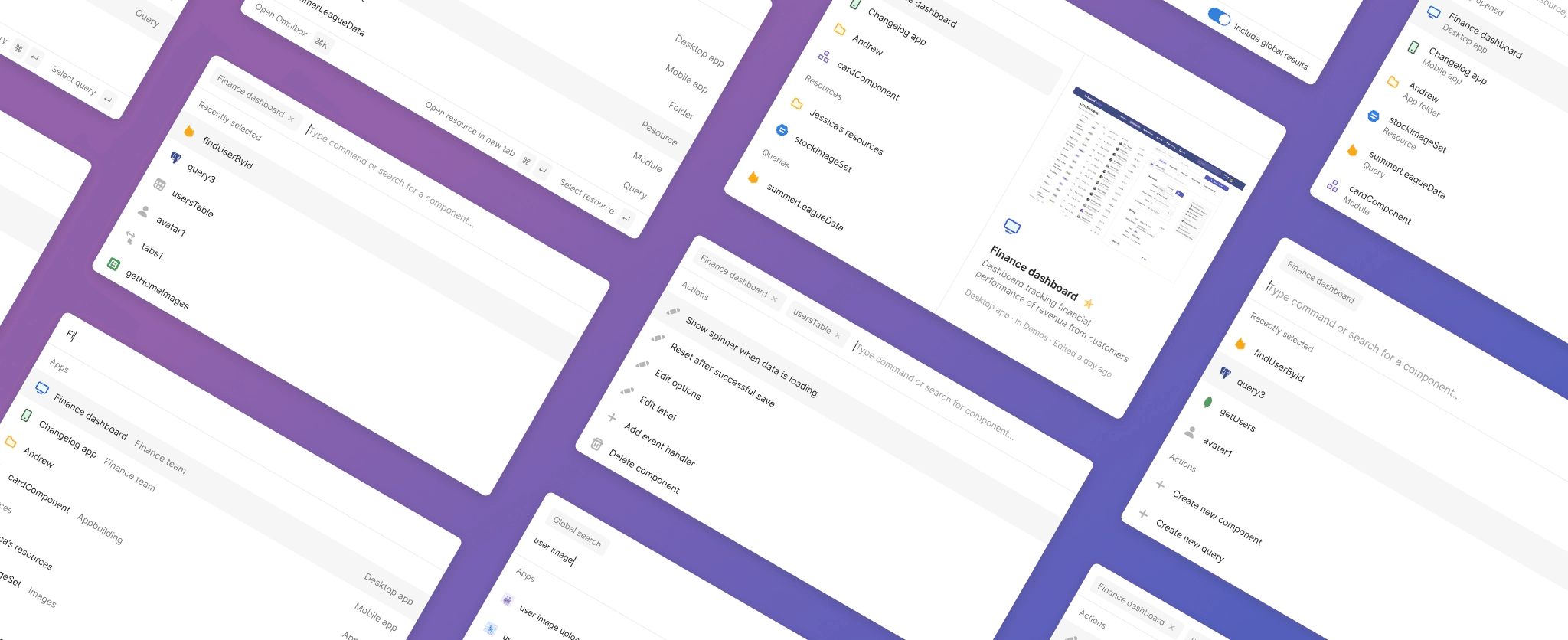
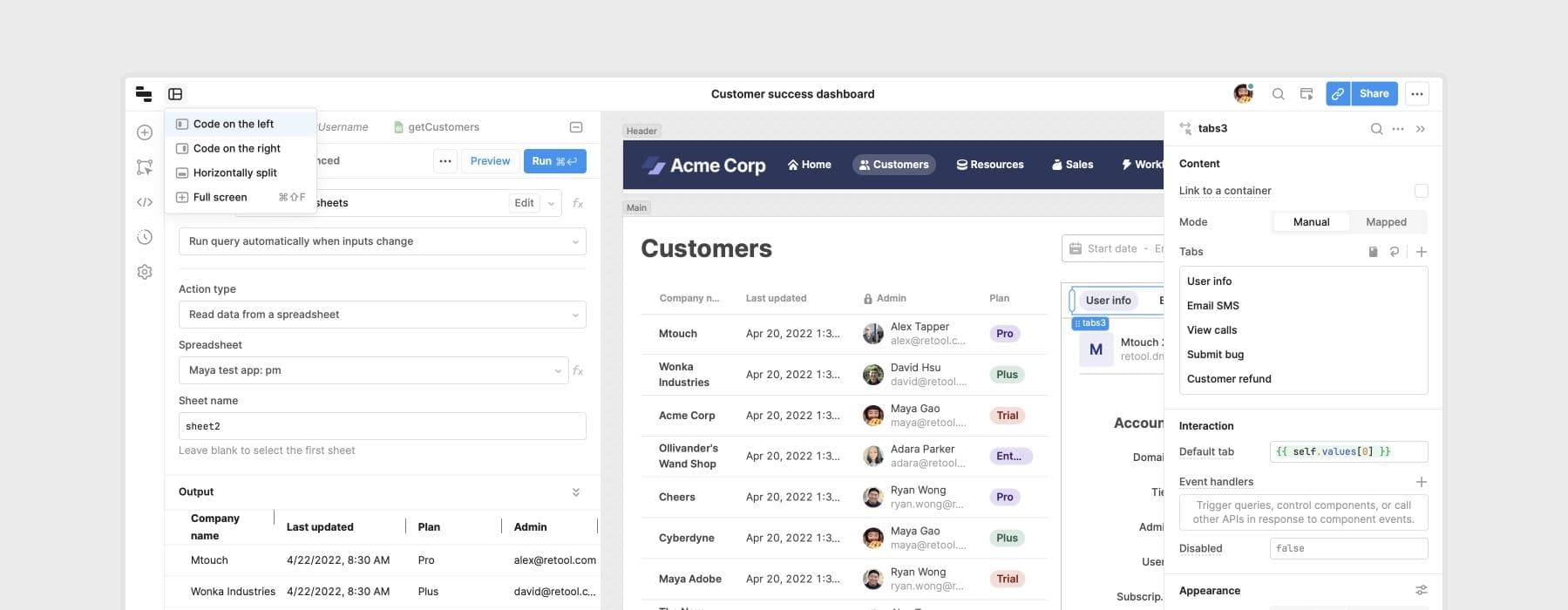
Retool is a platform for developers, and since our core product is an IDE, speed and ergonomics matter. Retool lets developers build incredibly complex apps, so our power users may be working with dozens of queries and hundreds of components in a single app. We heard from users that common workflows—like searching for queries or finding relevant component properties—could feel cumbersome, and wanted to offer a faster approach.
We explored a variety of solutions to this problem, like introducing a more robust set of keyboard shortcuts and adding local search inputs to our component tree and property inspectors. However, they felt incremental rather than a step function improvement on the status quo. Ultimately, we settled on building a command palette—something that we loved in many other products, but that we felt could be enhanced in a few ways relevant to Retool's unique visual IDE. This blog post is a peek behind the process of designing the command palette and the decisions we made along the way.
Command palettes as an interaction pattern have exploded in the last few years, popularized by products such as VSCode, Superhuman, and Linear. They’re a hybrid between pure command line interfaces and more discoverable GUIs, accommodating the lack of native menu bars in web apps. By offering a solution that keeps the speed of a keyboard-oriented interface while also being easier to learn than a pure command line interface, command palettes enable users to quickly find available commands and see relevant menu items.

At Retool, we value thinking from first principles, but that doesn't come with a "not invented here" culture: there's a lot to be learned from teams that have worked on these kinds of problems in the past.
After surveying prior art in this area, we found that most command palettes fell into one of two categories:
This category includes command palettes that are primarily focused on finding content. Rather than using the command palette to perform actions, users rely on patterns like context menus and direct manipulation. Examples include command palettes from Things, macOS, and Notion.

This category includes command palettes that are primarily focused on performing actions like archiving emails or triaging project issues. While these command palettes can offer the ability to search for content, actions and content tend to stay separate. Rather than coexisting with actions, search experiences exist as a separate modality that can be activated with a search action. Examples include command palettes from Superhuman, Linear, and Cron.

For Retool, we wanted a command palette that could both search for content and execute actions without privileging one experience over the other. Our users regularly need to search for components and queries inside of apps, while also performing actions like editing custom keyboard shortcuts or modifying specific component properties. We also have a vast array of actions, both at the app level and the component level: we have over 100 components, each of which can contain upwards of 50 customizable properties. Finding a way to integrate all of this functionality into a single surface came with a set of unique design challenges.
Since we wanted to include the ability to both search for components/queries and perform actions inside of an app, we needed to define entry points and surfaces for each experience. Existing solutions tended to separate content and actions via modalities—VSCode, for example, had one mode for searching files and another for performing actions.

While we felt that this approach had its merits, we ended up diverging from a bifurcated model for two reasons. First, it came with additional mental overhead: before doing anything, users first had to think about whether they were performing an action or searching for something, then remember how to trigger the appropriate mode. Second, applying this model to Retool was particularly tricky because the lines between “actions” and “search” could get blurred—when someone wants to edit the text label on a button component, for example, it’s unclear whether they’re performing an action (focusing the input in the property inspector) or searching for a property.

Our solution was to combine actions and search results into one surface, using sections to separate the two but keeping the core surface the same. To mirror Retool’s existing information architecture, we split up results into three categories: actions, components, and code. This approach enabled us to accommodate both action and content search without introducing unnecessary friction when users wanted to use one or the other.

Separating results into categories, however, introduced a new problem: top search results could occasionally be deprioritized. For example, if the best match for a search term was a button component while the second best match was a Javascript query, the query would get pushed below everything in the “Components” section. To mitigate this, we introduced a “Top result” section, ensuring that the best match always bubbled to the top regardless of category.

We also faced the challenge of figuring out how to manage different levels of scope. Since we had items at a global level (searching for apps and resources), app level (finding components and queries), and component level (editing specific component properties), we needed an intuitive way of grouping them in the command palette.
We tried a few potential directions, like providing an action to trigger a global search mode or using a toggle to filter global results.


We also explored the idea of surfacing component and app-level actions in the same list, disregarding the concept of scope entirely.

Most of these solutions, however, brought in unnecessary complexity or introduced unwanted behavioral inconsistencies. Surfacing everything in the same list felt overwhelming, and keeping global search as a persistent toggle didn’t make sense when users primarily wanted to see local components and queries when building Retool apps. We ended up building a scoping model instead, where actions and search results were limited to users’ current scope. With this model, users can move up in scope by deleting context pills, and move down in scope by selecting apps, components, or queries.

We liked that this solution hid unnecessary complexity: users usually didn’t need to search for a different app when they were inside the context of a component, or perform app-level actions like modifying URL parameters when they were focused on editing a table column. It also enabled users to focus on relevant actions without completely locking them into their current scope. By allowing users to quickly move up and down levels of scope, we were able to capture the advantages of a more focused model without making navigation feel slow or cumbersome.
The third challenge we faced involved defining the behavior for component and query selection. Because users could perform actions on specific components and queries through the command palette, it wasn’t immediately clear what should happen after users selected a component or query in the list: should we keep the command palette open, placing them into the context of the component/query, or should we dismiss the command palette and select the component/query on the canvas?


Both use cases were valid: people less familiar with the product likely just want to switch between different components, exploring the property inspector visually instead of searching directly via the command palette. Power users, on the other hand, may want the command palette to stay open, preferring to perform entire workflows with their keyboard.
We decided to keep the command palette open, since it was ultimately a feature geared towards power users. To make the second use case more accessible, we made the first action under every component “select in editor.” Under this model, users who wanted to keep the command palette open would hit enter once, while users who wanted to jump straight into component/query selection would hit enter twice. This interaction allowed power users to do everything from the keyboard while also accommodating the secondary use case of jumping users directly to a component or query.


Our command palette is live for all cloud customers and will be available in our upcoming on-premise v2.107 release. If you want to learn more about how it works, check out our launch blog post.
There were many other considerations that we didn’t cover in this blog post, as well as future directions that enable even more complex workflows like component creation and code editing to be performed entirely through the command palette. We're excited to see how users interact with this new unified command palette model—and suspect there's a lot more room for leveraging this pattern as a way to bring building software closer to the speed of thought.
light Reader


