

Nobody likes working with dates (especially in Javascript), but unfortunately it's inevitable. If your app requires a date picker component (think: users select a date from a calendar), HackerOne has you covered with the react-datepicker library. This guide will walk through react-datepicker basics with a focus on building internal tools.
By the end of this article, you’ll know how to:
- Import and use
react-datepickerin your React app to build a simple datepicker - Customize your datepicker with time functionality, disabling dates, and a clear button
If you just want to grab the code and go, check out the tl;dr at the end of the article.
One note before we start: this article has been updated for 2024 but was originally published in 2020.
react-datepicker is a React library that is used by more than 237K developers with almost 8K stars on GitHub. The simple version of the datepicker component is incredibly easy to use and comes with some useful features like:
- Localization
- Accessibility
- Advanced customization
- Range support
Because it uses date-fns instead of moment, the entire library comes out to 437kB. It runs on the latest versions of Chrome, Firefox, and IE10+.
In this tutorial, we'll build an internal tool for a customer support team. Let’s say that we’ve already built a table that displays order data using react-table—that's a great first step! But to make this tool truly useful, customer support reps need to be able to filter their view to a specific set of dates. That's where datepicker comes in.
The customer support rep needs to be able to:
- Open a calendar view when the datepicker is clicked
- Select a range of date values and times
- Not select future dates
- Clear the datepicker by clicking the “X” button
In other words, here's how the final product should look and feel:
With Retool, you can build applications with 50+ drag-and-drop components including a datepicker.
If you're just here for the code, go ahead and jump to the TL;DR syntax summary.
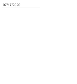
Let’s keep things simple to start off: we’ll create one datepicker that only allows the user to select a single date field—no other bells and whistles.
We'll leverage the useState() hook in our function. If you’re not familiar with React Hooks, we recommend checking out React’s Hooks docs before starting this tutorial.
There are three simple steps for creating a datepicker:
- Import the datepicker component from
react-datepickerandreact-datepicker.cssfor styling. - Set an initial date in the state (using the
useState()Hook). - Render the datepicker, telling
onChangeto update the date in state using thesetDate()function.
1 2 3 4 5 6 7 8 9 10import React, { useState } from "react"; import DatePicker from "react-datepicker"; import "react-datepicker/dist/react-datepicker.css"; export default function TableDatePicker() { const [date, setDate] = useState(new Date()); return <DatePicker selected={date} onChange={(date) => setDate(date)} />; }
And, voila, you have a datepicker that starts on today’s date and will open a calendar to select a new date when clicked!
The first feature we are going to add is the ability to set a date range on our datepicker. We want our customer support reps to be able to narrow down orders that happened between a specific set of dates.
react-datepicker doesn’t have native support for ranges, but we can get around it by doubling the datepicker component: one for the start date and one for the end date. Now that we already have our first datepicker, we simply need to adjust it to specifically handle a start date:
1 2 3 4 5 6 7 8 9 10 11 12export default function TableDatePicker() { const [startDate, setStartDate] = useState(new Date()); return ( <DatePicker selected={startDate} onChange={date => setStartDate(date)} selectsStart // tells this DatePicker that it is part of a range* startDate={startDate} /> ); }
Then, we'll create a second datepicker that can handle the end date. Note that the endDate datepicker needs a minDate to be set. Since we’re picking a range, we can’t have the endDate be earlier than the startDate (time doesn’t work like that!).
1 2 3 4 5 6 7 8 9 10 11 12 13 14 15 16 17 18 19 20 21 22 23 24export default function TableDatePicker() { const [startDate, setStartDate] = useState(new Date()); const [endDate, setEndDate] = useState(new Date()); return ( <div> // don't forget to wrap your DatePickers <DatePicker selected={startDate} selectsStart startDate={startDate} endDate={endDate} // add the endDate to your startDate DatePicker now that it is defined onChange={date => setStartDate(date)} /> <DatePicker selected={endDate} selectsEnd startDate={startDate} endDate={endDate} minDate={startDate} onChange={date => setEndDate(date)} /> </div> ); }
And that’s it! The final version of the code all put together will look like this:
1 2 3 4 5 6 7 8 9 10 11 12 13 14 15 16 17 18 19 20 21 22 23 24 25 26 27 28 29import React, { useState } from "react"; import DatePicker from "react-datepicker"; import "react-datepicker/dist/react-datepicker.css"; export default function TableDatePicker() { const [startDate, setStartDate] = useState(new Date()); const [endDate, setEndDate] = useState(new Date()); return ( <div> <DatePicker selected={startDate} selectsStart startDate={startDate} endDate={endDate} onChange={date => setStartDate(date)} /> <DatePicker selected={endDate} selectsEnd startDate={startDate} endDate={endDate} minDate={startDate} onChange={date => setEndDate(date)} /> </div> ); }
Now we have two datepickers that the customer support reps can use to select their ranges. Plus, the react-datepicker library already handles highlighting the selected dates for us.

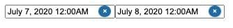
Let’s assume that our example company has thousands of rows of data, filled with row after row of customer order data. Even if reps only select a couple days, they’ll still get flooded with a ton of data. To make life easier for them, let’s add a time option to the datepicker so that reps can filter things down to an even more granular level.
react-datepicker comes with two options for adding time to the calendar view:
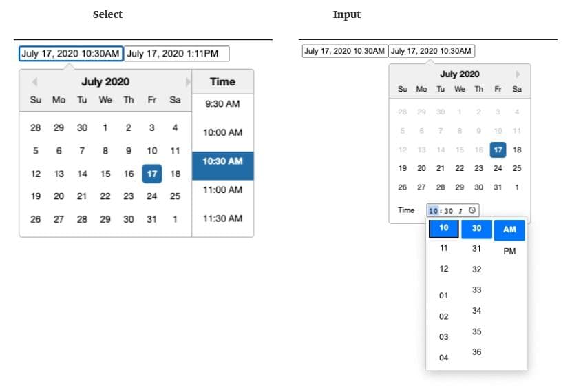
While the input version can be very useful since it lets the user type in any time they want, we’re going to go with the select version because we’re okay with only letting our customer support reps choose times in half-hour increments.
To add the time selector to our datepickers, we’ll first add showTimeSelect to our datepicker component to let it know we want to display the time selector, and then we’ll format the date that’s displayed in the datepicker window so that it shows time too.
1 2 3 4 5 6 7 8 9 10 11 12 13 14 15 16 17 18 19 20 21 22 23 24 25 26const [startDate, setStartDate] = useState(null); const [endDate, setEndDate] = useState(null); return ( <> <DatePicker showTimeSelect dateFormat="MMMM d, yyyy h:mmaa" selected={startDate} selectsStart startDate={startDate} endDate={endDate} onChange={(date) => setStartDate(date)} /> <DatePicker showTimeSelect dateFormat="MMMM d, yyyy h:mmaa" selected={endDate} selectsEnd startDate={startDate} endDate={endDate} minDate={startDate} onChange={(date) => setEndDate(date)} /> </> );
Hey, that took almost no time at all (sorry).
We've just barely scratched the surface of what react-datepicker can do. A few useful ones:
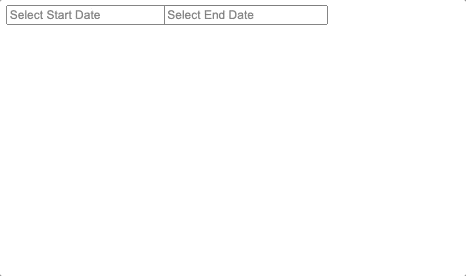
Instead of having the datepicker start on today’s date, why don’t we prompt the user to enter a start and end date so that our range datepicker is a little more clear? To do this, we need to add a placeholderText field and change the initial startDate and endDate values to null.
1 2 3 4 5 6 7 8 9 10 11 12 13 14 15 16 17 18 19 20 21 22 23 24 25 26 27 28 29 30 31export default function TableDatePicker() { const [startDate, setStartDate] = useState(null); const [endDate, setEndDate] = useState(null); return ( <div> <DatePicker placeholderText="Select Start Date" showTimeSelect dateFormat="MMMM d, yyyy h:mmaa" selected={startDate} selectsStart startDate={startDate} endDate={endDate} onChange={(date) => setStartDate(date)} /> <DatePicker placeholderText="Select End Date" showTimeSelect dateFormat="MMMM d, yyyy h:mmaa" selected={endDate} selectsEnd startDate={startDate} endDate={endDate} minDate={startDate} onChange={(date) => setEndDate(date)} /> </div> ); }
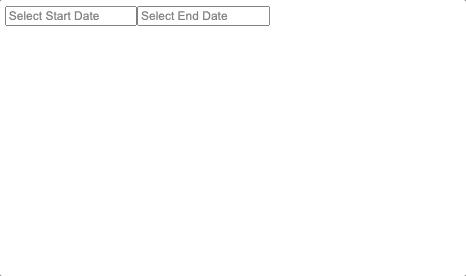
Now, the user can easily choose a start and end date and time in a logical order.
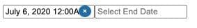
Since our reps are dealing with orders from customers, all of the data in the table they are viewing will be in the past. If they were to select a date in the future, there would be no data to view, and the rep would be looking at an empty table. Instead of that happening, lets disable all future dates in the calendar so that the rep can’t select them.
For this feature, we’re going to add the filterDate field and define an arrow function that returns a Boolean value depending on whether the date displayed is in the future or not.
1 2 3 4 5 6 7 8 9 10 11 12 13 14 15 16 17 18 19 20 21 22 23 24 25 26 27 28<DatePicker filterDate={d => { return new Date() > d; }} placeholderText="Select Start Date" showTimeSelect dateFormat="MMMM d, yyyy h:mmaa" selected={startDate} selectsStart startDate={startDate} endDate={endDate} onChange={date => setStartDate(date)} /> <DatePicker filterDate={d => { return new Date() > d; }} placeholderText="Select End Date" showTimeSelect dateFormat="MMMM d, yyyy h:mmaa" selected={endDate} selectsEnd startDate={startDate} endDate={endDate} minDate={startDate} onChange={date => setEndDate(date)} />
Great! Now the rep will only be able to filter the table based on dates that actually have order data, and we avoid time travel paradoxes.

If the customer support rep decides that they no longer want to filter by date, we want to make it easy for them to clear the filter. Let’s give them a simple X they can press to clear the datepicker.
1 2 3 4 5 6 7 8 9 10 11 12 13 14 15 16 17 18 19 20 21 22 23 24 25 26 27 28 29<DatePicker isClearable filterDate={d => { return new Date() > d; }} placeholderText="Select Start Date" showTimeSelect dateFormat="MMMM d, yyyy h:mmaa" selected={startDate} selectsStart startDate={startDate} endDate={endDate} onChange={date => setStartDate(date)} /> <DatePicker isClearable filterDate={d => { return new Date() > d; }} placeholderText="Select End Date" showTimeSelect dateFormat="MMMM d, yyyy h:mmaa" selected={endDate} selectsEnd startDate={startDate} endDate={endDate} minDate={startDate} onChange={date => setEndDate(date)} />
This one is just a simple Boolean prop type that is passed in to datepicker. Here is what the default clear button looks like:
At this point we should probably let you know that we added a little extra styling to make the datepicker look this way. If you choose to display the time in your datepicker, the clear button sits right on top of it, like this:
In order to expand the width of the datepicker boxes, we have to override some of the styling that we imported in react-datepicker.css. To do this, we are going to use Styled Components, a popular React library used for low-level styling.
First, import styled-components, and then define a new Styles component that will wrap around your datepicker. Then, move all of your datepicker code into a new function. You want your default function to export just your datepicker code (all wrapped up) with the <Styles> component around it.
Take careful note of the react-datepicker classnames that must be overwritten:
react-datepicker-wrapperreact-datepicker__input-containerreact-datepicker__input-container input
1 2 3 4 5 6 7 8 9 10 11 12 13 14 15 16 17 18 19 20 21 22 23 24 25 26 27 28 29 30 31 32 33 34 35 36 37 38import React, { useState } from "react"; import DatePicker from "react-datepicker"; import "react-datepicker/dist/react-datepicker.css"; import styled from "styled-components"; const Styles = styled.div` .react-datepicker-wrapper, .react-datepicker__input-container, .react-datepicker__input-container input { width: 175px; } `; export function DatePickerRange() { const [startDate, setStartDate] = useState(null); const [endDate, setEndDate] = useState(null); return ( <div> <DatePicker isClearable ... /> <DatePicker isClearable ... /> </div> ); } export default function TableDatePicker() { return ( <Styles> <DatePickerRange /> </Styles> ); }
And now that we’re overwriting classnames from react-datepicker, we might as well change up the style of our clear button. To override the button styles, you just need to change .react-datepicker__close-icon::before and .react-datepicker__close-icon::after.
1 2 3 4 5 6 7 8 9 10 11 12const Styles = styled.div` .react-datepicker-wrapper, .react-datepicker__input-container, .react-datepicker__input-container input { width: 175px; } .react-datepicker__close-icon::before, .react-datepicker__close-icon::after { background-color: red; } `;
Here is our new, styled X button:
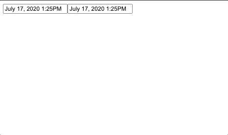
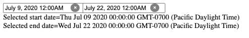
Extracting the selected date(s) from your datepicker will depend on how your code is set up. For example, if I’m within the same component, getting the startDate and endDate is as simple as accessing the state.
1 2 3 4 5 6 7 8<div> <div style={{ display: "flex" }}> <DatePicker ... /> <DatePicker ... /> </div> <div>Selected start date={startDate ? startDate.toString() : null}</div> <div>Selected end date={endDate ? endDate.toString() : null}</div> </div>
Here you can see we are printing the selected date below the datepickers. Note that startDate and endDate are saved as Date objects so you must convert them to Strings with the toString() method before printing (or else your IDE will yell at you).
If you are working with multiple React components, then you will likely need to lift the state out of the datepicker components. That work goes a bit beyond the scope of this tutorial, but you can read up on how to do it in the React docs.
You’ve now built an intuitive datepicker for your internal app! Here is our final datepicker:
Hopefully, this tutorial helped you understand how to create and customize a datepicker in React to suit your needs. We know we covered a lot of features here, so for good measure, here is the code for the datepicker we created, in its entirety:
1 2 3 4 5 6 7 8 9 10 11 12 13 14 15 16 17 18 19 20 21 22 23 24 25 26 27 28 29 30 31 32 33 34 35 36 37 38 39 40 41 42 43 44 45 46 47 48 49 50 51 52 53 54 55 56 57 58 59 60 61 62 63 64 65import React, { useState } from "react"; import DatePicker from "react-datepicker"; import "react-datepicker/dist/react-datepicker.css"; import styled from "styled-components"; const Styles = styled.div` .react-datepicker-wrapper, .react-datepicker__input-container, .react-datepicker__input-container input { width: 175px; } .react-datepicker__close-icon::before, .react-datepicker__close-icon::after { background-color: grey; } `; export function DatePickerRange() { const [startDate, setStartDate] = useState(null); const [endDate, setEndDate] = useState(null); return ( <div style={{ display: "flex" }}> <DatePicker isClearable filterDate={(d) => { return new Date() > d; }} placeholderText="Select Start Date" showTimeSelect dateFormat="MMMM d, yyyy h:mmaa" selected={startDate} selectsStart startDate={startDate} endDate={endDate} onChange={(date) => setStartDate(date)} /> <DatePicker isClearable filterDate={(d) => { return new Date() > d; }} placeholderText="Select End Date" showTimeSelect dateFormat="MMMM d, yyyy h:mmaa" selected={endDate} selectsEnd startDate={startDate} endDate={endDate} minDate={startDate} onChange={(date) => setEndDate(date)} /> </div> ); } export default function TableDatePicker() { return ( <Styles> <DatePickerRange /> </Styles> ); }
For more code samples that cover every feature react-datepicker has to offer, check out React Datepicker’s website.
Retool also offers a complete set of powerful building blocks for building internal tools. Assemble your app in 30 seconds by dragging and dropping from more than 50 pre-built components. Start building today.
1 2 3 4 5 6 7 8 9 10 11import React, { useState } from "react"; import DatePicker from "react-datepicker"; import "react-datepicker/dist/react-datepicker.css"; export default function TableDatePicker() { const [date, setDate] = useState(new Date()); return <DatePicker selected={date} onChange={(date) => setDate(date)} />; }
1 2 3 4 5 6 7 8 9 10 11 12 13 14 15 16 17 18 19 20 21 22 23 24 25export default function TableDatePicker() { const [startDate, setStartDate] = useState(new Date()); const [endDate, setEndDate] = useState(new Date()); return ( <div> <DatePicker selected={startDate} selectsStart startDate={startDate} endDate={endDate} onChange={(date) => setStartDate(date)} /> <DatePicker selected={endDate} selectsEnd startDate={startDate} endDate={endDate} minDate={startDate} onChange={(date) => setEndDate(date)} /> </div> ); }
1 2 3 4 5 6<DatePicker showTimeSelect dateFormat="MMMM d, yyyy h:mmaa" selected={date} onChange={(date) => setDate(date)} />;
1 2 3 4 5 6 7 8 9 10 11export default function TableDatePicker() { const [date, setDate] = useState(null); return ( <DatePicker placeholderText="Select Date" selected={date} onChange={(date) => setDate(date)} /> ); }
1 2 3 4 5 6 7<DatePicker filterDate={(d) => { return new Date() > d; }} selected={date} onChange={(date) => setDate(date)} />;
1 2 3 4 5<DatePicker isClearable selected={date} onChange={date => setDate(date)} />
Reader

