
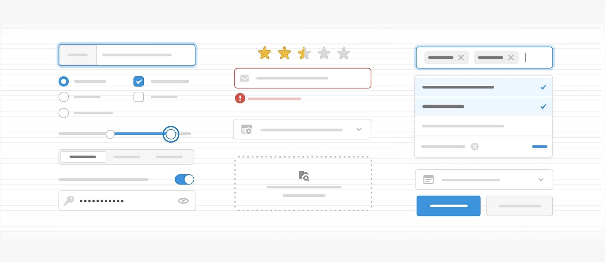

Input components are the backbone of any internal tool UI. Components like text and number fields, selects, radios, sliders, and date pickers are the primary interface for end users to take action in your apps.
If you need to add input components to your app without building them entirely from scratch, it can be hard to find everything you’re looking for in a single component library. Even with popular libraries, you’ll need to tweak and customize components to achieve your baseline functionality, formatting, and validation—not to mention any extra design changes needed to make your app look cohesive.
As developers ourselves, we wanted to fix that.
Today, we’re excited to roll out 35+ UI components rebuilt and redesigned from the ground up, amounting to one of the most comprehensive and configurable input libraries available. The immediate advantage for you as a Retool developer? You can build polished user interfaces faster while simultaneously writing less redundant code.
We’re investing in our input components to remove friction for developers building any UI in Retool. To do that, we’ve expanded our library to 1) provide brand new input components to unblock new UI patterns, 2) add more robust functionality to our existing input components, and 3) offer powerful, preconfigured components for immediate utility.
A number of brand new inputs allow for data expression previously unavailable within Retool. This update introduces the Range Slider component, allowing users to select a range of values from a predetermined spectrum.
Another new component, Segmented Control, allows users to select one value from a linear set of concise options (e.g., switching between a 3D or satellite map view), a common alternative to our Radio Group or Select components.
Collectively, these amount to a broader variety of accepted data types and expand upon visual variety within Retool applications—all from a single input library.


Some new components improve previously cumbersome UI experiences. Take, for instance, the new Listbox and Multiselect Listbox components that allow you to display a list of selectable items to your end users. These new components create a much clearer path to a list detail view for, say, viewing client records or creating vendor directories, with much shorter setup compared to manually configuring a table component.

Other brand new components add variety depending on your visual preferences or the desired user experience. For example, you will now find two new UI components to support file sharing: File Input and File Dropzone. While they all offer functionality similar to the existing File Button—like custom validation options and the option to parse files—these additional choices allow you to have more control over your application presentation.

We didn’t just build new components and presets—we rebuilt our entire library from the ground up, with existing components gaining much more robust functionality and configuration options.
Select and Multiselect saw a number of incremental improvements. Both components have a lot of new configuration options, including combobox mode, overlay height to set the maximum height of the dropdown area, and the option to denote a selection indicator (like a checkmark) or designate an empty state.
We’ve also introduced virtualization under the hood, meaning options that are visible on the screen are rendered performantly as you scroll. Whether your users are scrolling through tens of values or thousands, their experience will be speedy and seamless. Additionally, Multiselect now grows in line with your selections: if you select 20 tags, the display will automatically grow to accommodate all 20 selections with no manual configuration needed.

We’ve also overhauled Editable Text and broken out numeric functionality into its own component, Editable Number. In addition to their ability to edit static text on click, each component now carries the same features of the core Text and Number inputs like configurable prefix/suffix text, built-in validation rules, and, for Editable Number, specialized formatting like percentage, currency, and more. You can also choose text size—for example, designate a text box as an H1 heading—so that you can use this as an easy customizable text component for your end users wherever you need.

In order to present the “smartest” defaults possible—options that get you started fast with minimal manual configuration—we’ve introduced presets and variants to existing components.
Text Input, for example, has new Email and URL presets, preconfigured with appropriate formatting, validation, labels, and adornments so they’re instantly ready to use. Similarly, Number Input comes with use-case-specific presets like Percent and Currency to reduce the time editors spend on configuration.

Smarter defaults also means giving our input components the ability to accept and parse the widest variety of user interactions.
Our new suite of calendar inputs, including Date, Date Time, and Date Range, can now accept dates in any known date/time format with automatic parsing under the hood. With built-in rules accepting relative dates like “this Friday” or “3 weeks ago”, your users can input the formats most obvious to them, and you don't have to worry about writing complex validation or Regex.

Timezone management is also drastically simplified. Before, and in many other UI component libraries, there was limited control over how different time zones were handled while parsing, rendering, and outputting a date. Now, it’s much easier to select timezone offsets for rendering and output. For example, you could configure for dates to always be rendered in the end user’s local time (even if they’re stored in GMT in the database).
These updates aren’t only to enhance the aesthetics of individual components, but your experience of building with them as well. Here are the improvements we made across all inputs:
From the color of the Checkbox icon to the rounded corners on a Button, we’ve expanded the Style Editor cohesively across all inputs so you can make our components your own. All components now have the ability to add adornments like tooltips, and text and icons in the prefix or suffix, with thousands of new icons to choose from.

Expanded validation
Every single new input comes with built-in validation options, allowing you to mark any field as required, limit character counts, check a regex pattern, clamp numbers, and control upload size. Don’t see a parameter you need? You can now add custom validation by writing a JavaScript expression to return an error message.

Full accessibility
Keyboard accessibility is a must for fast data entry. We’ve built every new component with beautiful focus states and full keyboard support so end users can work quickly and comfortably.
For example, you can now use arrow keys to navigate dropdown lists like Select/Listbox and their Multiselect counterparts. We also built in support for screen readers and automatic text color selection so your apps can be used by people with a wide range of abilities. Each new input has been built according to WAI-ARIA Authoring Practices and WCAG Level AA.

Improved developer ergonomics
When it comes to day-to-day life in the Retool editor, we always sweat the small things like exploring different application formats as you build. The increased cohesion between component presets and variants makes it easy to iterate on your UI in Retool—in just one click, you can swap component selections and we’ll transfer over all applicable settings like label configuration, layout, event handlers, and even tooltips.

We know that components will keep evolving along with your use cases, so we’ve architected them to be ultra extensible, enabling us to adapt faster to future iterations. So, keep that feedback coming! Want a new component or think an improvement is in order? Join the Retool community and let us know.
We’re excited to share new updates over the next few weeks. Meanwhile, be sure to check our complete component library or, if you’re an existing customer, learn how to upgrade your deprecated components.
