

This post was written with help from Marie Starck.
In this article, you’ll learn how to build a slider in React with react-slider, a popular little component / library that Zillow open sourced back in 2021. We’ll cover how to customize the various components of the slider (dimensions, values, colors, etc.).
If you'd like to follow along on the completed project, you can see it in this GitHub repository.
Let’s dive in!
Before we start writing code, let’s get our terms in order: sliders are composed of a track, a thumb, and if necessary, marks, indicated in the diagram below.
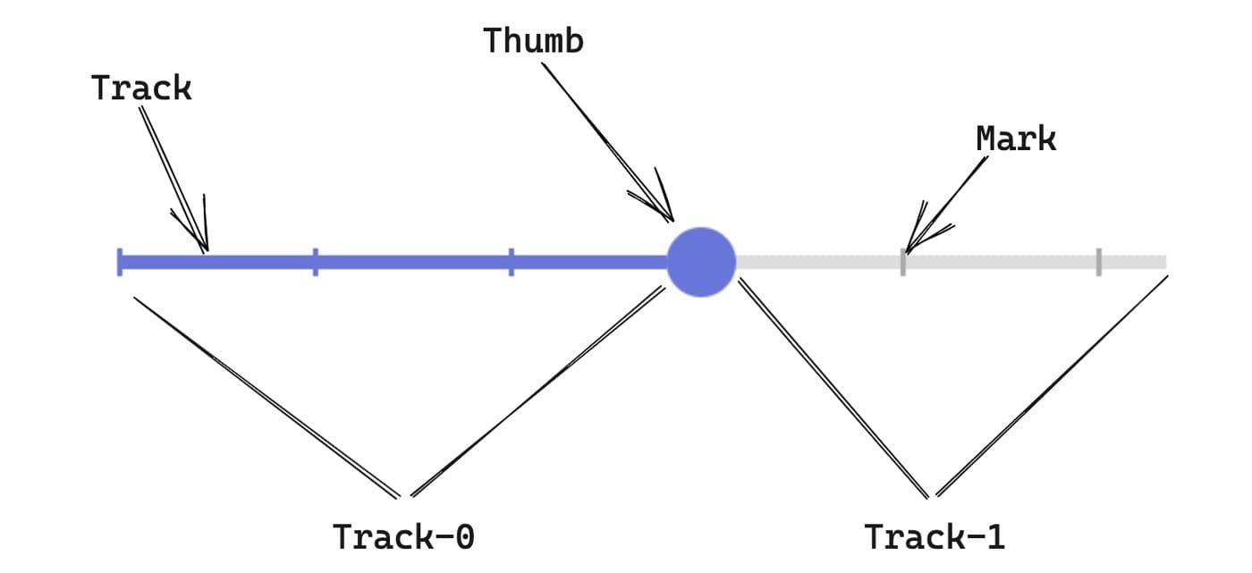
- The track is the bar that represents the range of possible values, and is what the thumb moves on.
- The thumb marks the current value of your slider. Its movement is restricted to the track.
- The marks, sometimes also called ticks, represent various predefined values on your range. Each one can be clickable, which will move the thumb to its position.
- track-0 and track-1 are specific to
react-sliderand are names for two CSS classes to select the part of the track before and after the thumb, respectively. These classes will be very helpful when styling your slider.
You'll need a React project to use with this tutorial. If you don't already have one, you can easily create one with Create-React-App:
1npx create-react-app my-app
Then, in your project directory, install the react-slider library by running the following command:
1npm install react-slider
To get things started, we’ll just render the default component. Inside your project, in src folder, create a file called Slider.js and add the component with your newly installed library:
1 2 3 4 5 6 7 8 9import ReactSlider from "react-slider"; const Slider = () => { return ( <ReactSlider /> ); };ls export default Slider;
Then, in App.js, import your new slider and add it to your application:
1 2 3 4 5 6 7 8 9 10 11 12import './App.css'; import Slider from './Slider' function App() { return ( <div className="App"> <Slider /> </div> ); } export default App;
Save both files and reload your application. Don't be alarmed when reloading results in a blank screen! If you open your dev tools, you'll see that the slider is there, just not yet visible:
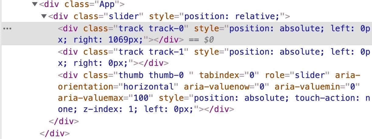
This brings us to an important point about react-slider, which is that it’s not really an out-of-the-box solution. You can think of it like d3 – it’s more of a lower level framework that prioritizes customizability and power over ease of use (“just building a chart”). In its most basic form, it’s simply some div elements. To make them display in your app, you have to do some basic styling.
The following sections will walk you through the process of creating a simple slider.
There are two ways to customize your track:
renderTrackprops: A custom render function that allows you to render the track portion of the slider. Essentially, it looks like:renderTrack={(props, state) => <div {...props} />}.trackClassNameProps: A CSS class for the track.
Using trackClassName is the easiest way to style your track. In your Slider component, simply add it to your slider along with a class for the whole slider:
1 2 3 4 5 6 7 8 9 10 11 12import ReactSlider from "react-slider"; const Slider = () => { return ( <ReactSlider className="customSlider" trackClassName="customSlider-track" /> ); }; export default Slider;
Once the classes are set, you can write some CSS. If you are in a new React project, just head to your index.css file in your src folder.
Start by creating some global CSS variables for your colors. If you need to change things in the future, this will make it much easier, since you'll only have to change them in one place.
1 2 3 4 5:root { --main-color: rgb(104, 117, 217); --main-color-hover: rgb(104, 117, 217, 0.2); --track-color: #ddd; }
In the same file, we’ll add some simple styling. Important properties to set are:
- A max-width for your slider, in pixels
- The height (or thickness) of the track, in pixels
- A top value for the track. Without this, both the track and the thumb will be set to
top: 0, which is the top of the div element. However, you want your track to be centered under the thumb. In order to do this, you need to lower the height of the track by setting a top value. The specific value depends on how big your thumb will be—bigger thumbs will need bigger values. - The color value of the track. This will have two parts:
track-0andtrack-1. The former is the part of the track before your thumb, while the latter is the default color of the track and is displayed after your thumb.
The end result will be something like this:
1 2 3 4 5 6 7 8 9 10 11 12 13 14 15 16 17 18 19 20 21 22 23 24 25 26:root { --main-color: rgb(104, 117, 217); --main-color-hover: rgb(104, 117, 217, 0.2); --track-color: #ddd; } .customSlider { /* max width of your slider */ max-width: 300px; /* Optional: Only If you want to center your slider in the page */ margin: auto; } .customSlider-track { /* Top value to align your track to the center of your thumb */ top: 8px; /* thickness of the track */ height: 4px; /* default color of your track */ background: var(--track-color); } .customSlider-track.customSlider-track-0 { /* color of the track before the thumb */ background: var(--main-color); }
After refreshing your browser, you'll see this:
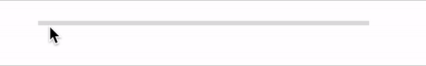
Your track is now visible, and technically, you can select a value. It’s not very practical without a thumb, though, so let’s make one.
Going back to Slider.js, add a class for your custom thumb using thumbClassName:
1 2 3 4 5 6 7 8 9 10 11 12 13import ReactSlider from "react-slider"; const Slider = () => { return ( <ReactSlider className="customSlider" trackClassName="customSlider-track" thumbClassName="customSlider-thumb" /> ); }; export default Slider;
Then, for your styling, create the class customSlider-thumb in your CSS file. Remember that the slider is ultimately a list of div elements. This means that you'll need a few things:
- A cursor pointer, so that the user knows there is an interaction available (clicking or dragging).
- A shape for your thumb. This can be anything you want, but for this tutorial, weyou'll make it a circle. In CSS, you do so by making a square, and then using
border-radiusto round the edges into a circle. - A color for your thumb. As with the track,
backgroundis used to color your element.
In the end, you should have something similar to this:
1 2 3 4 5 6 7 8 9 10 11 12 13 14 15.customSlider-thumb { cursor: pointer; /*color for the thumb */ background: var(--main-color); /* shape of the thumb: circle */ width: 20px; height: 20px; border-radius: 100%; /* remove default outline when selected */ outline: none; } .customSlider-thumb:hover { box-shadow: 0 0 0 8px var(--main-color-hover); }
In this styling, an outline:none rule was added so as to not have a default border when the thumb is selected.
This example also adds some custom styling when the user hovers the thumb. This particular box-shadow styling mimics Material UI slider styling.
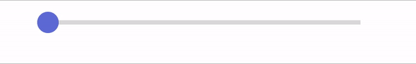
If you refresh, you should now be able to see the thumb:
At this point, you have a styled track and thumb. But what about marks?
As with the track, you can simply pass a custom class to markClassName, then addcreate some CSS styling to make them appear.
In your Slider component, there are a couple of interesting props you canwill use to set your marks:
min: The minimum value of your slider. Defaults to 0.max: The maximum value of your slider. Defaults to 100.marks: The marks that will appear. There are several ways to set this:- Pass an array of values, which means that only those values will appear.
- Pass a single number to indicate an increment; eg if you pass
5, there will be marks at five, ten, fifteen, and so on. - Set the value to true, which will cause all marks to appear.
markClassName: CSS class name for the marks.
We’ll start by setting some basic values for each of these:
1 2 3 4 5 6 7 8 9<ReactSlider className="customSlider" thumbClassName="customSlider-thumb" trackClassName="customSlider-track" markClassName="customSlider-mark" marks={20} min={0} max={100} />
In your CSS file, add some styling to make those marks more prominent:
1 2 3 4 5 6 7 8 9 10 11 12 13 14 15:root { --main-color: rgb(104, 117, 217); --main-color-hover: rgb(104, 117, 217, 0.2); --track-color: #ddd; /* Default mark color*/ --mark-color: #aaaaaa; } ... .customSlider-mark { cursor: pointer; top: 6px; width: 1.5px; height: 8px; background-color: var(--mark-color); }
If you refresh your browser, you should now see the marks:
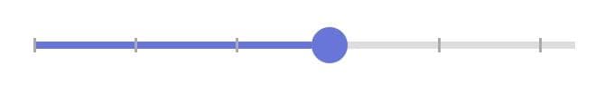
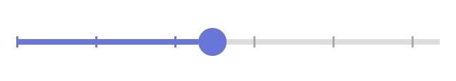
There are more ways to customize the marks. For example, they could be the same color as the track.
To do this, go back to your Slider component. Inside, you'll import the useState React hook to create a currentValue variable to keep track of your slider’s value. The React Slider library also offers props for defaultValue, value, and onChange, which you might already be familiar with.
1 2 3 4 5 6 7 8 9 10 11 12 13 14import { useState } from "react"; ... const Slider = () => { const [currentValue, setCurrentValue] = useState(0); return ( <ReactSlider ... defaultValue={0} value={currentValue} onChange={(value) => setCurrentValue(value)} /> ); };
There's also a renderMark prop. This provides a custom render function for your mark. In this function, we will have a class name that changes depending on if the mark’s value, or the key, is greater than, less than, or equal to the slider’s current value.
1 2 3 4 5 6 7 8 9 10 11<ReactSlider .... renderMark={(props) => { if (props.key < currentValue) { props.className = "customSlider-mark customSlider-mark-before"; } else if (props.key === currentValue) { props.className = "customSlider-mark customSlider-mark-active"; } return <span {...props} />; }} />
The Slider.js file to this point will look like this:
1 2 3 4 5 6 7 8 9 10 11 12 13 14 15 16 17 18 19 20 21 22 23 24 25 26 27 28 29 30 31import { useState } from "react"; import ReactSlider from "react-slider"; const Slider = () => { const [currentValue, setCurrentValue] = useState(0); return ( <ReactSlider className="customSlider" thumbClassName="customSlider-thumb" trackClassName="customSlider-track" markClassName="customSlider-mark" marks={20} min={0} max={100} defaultValue={0} value={currentValue} onChange={(value) => setCurrentValue(value)} renderMark={(props) => { if (props.key < currentValue) { props.className = "customSlider-mark customSlider-mark-before"; } else if (props.key === currentValue) { props.className = "customSlider-mark customSlider-mark-active"; } return <span {...props} />; }} /> ); }; export default Slider;
You'll also need some CSS for your customSlider-mark-before and customSlider-mark-active classes. Inside your CSS file, add the final styles needed to complete your slider:
1 2 3 4 5 6 7.customSlider-mark.customSlider-mark-before { background-color: var(--main-color); } .customSlider-mark.customSlider-mark-active { display: none; }
This will make the marks the same color as the track if they appear before the thumb, and disappear if they're under the thumb.
The result should look like this:
If you'd like to see the whole project in one place, you can do so at this GitHub repository.
Reader

