

Date and time formatting varies globally, which can confuse users when they need to input a date in a form. Should you include all four digits of the year? Is the form using military time? And should you include zeros before the hours (i.e., 07:30) for formatting purposes?
Date and time pickers (DTPs) help solve this problem by providing a simple UI component that utilizes intuitive pop-up or drop-down calendar elements.
DTPs can and are utilized all the time. As a user, you often see them when scheduling meetings, picking appointment times, or booking a hotel room.
In this article, you’ll learn how to implement a React time picker in a simple demo app. By the end of the tutorial, you’ll have a custom time picker in accordance with your website’s UI.
There are several types of time pickers, including drop-down, scrolling, and wheel. The UI layout of the time picker will help determine which type you should utilize in React.
A drop-down time picker is one of the simplest time pickers and is used to select the hour and minute in a drop-down format. It’s not as intuitive as other time pickers, but it’s better than a traditional text box because it lets you select from options rather than let the user input text on their own. This helps clear any confusion about the format that’s desired.
As the name suggests, when you use a scrolling picker, the user scrolls to select the required date or time information.
A wheel time picker resembles an actual clock and makes it easy for the user to select the correct time. It starts by asking for the hour and then intuitively changes the numbers on the wheel so that the user immediately selects the minutes next. Depending on the implementation, there are several ways you can change the value of the minutes. Some wheel time pickers show the numerical digits (ie hours or minutes) after you select them, and some have buttons that you can select. These buttons are usually simple arrows that let you toggle between the hours and minutes.

Now that you know how helpful time pickers can be, you’ll be learning to build one in React. In this tutorial, you’ll focus on a time picker that comes with Material-UI since it’s the most popular React library on GitHub.
Before you begin, you’ll need to download and install Node.js and npm.
To begin, you need to create your React app in the same place you’ll eventually build out your time picker. To do this, run the following command in your terminal:
1npx create-react-app time-picker
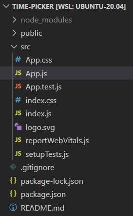
This command creates a React application with the following files:
Before you can use the time picker in Material-UI, you need to install two libraries: the Material-UI library and a library that will handle your dates. Many developers choose to use Moment.js for this because it’s simple; however, date-fns’s bundle size is almost four times smaller (19.5kB) than Moment.js’s (71.9kB), making date-fns a much faster option.
To install the libraries, you can use npm, the default package manager for React applications.
Start by changing the directory to your current project (which you installed in the previous section) with the command cd time-picker. Then install the Material-UI and date-fns libraries that you’ll be using later in this tutorial:
1 2cd time-picker npm install @date-io/date-fns date-fns @mui/material @mui/lab @emotion/react @emotion/styled
Now it’s time to build out your time picker. You have multiple options to choose from in the Material-UI library:
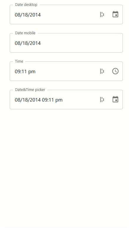
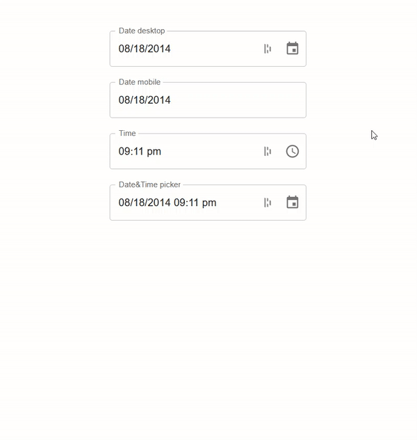
- Date desktop: selects dates with the UI most suitable for your desktop
- Date mobile: selects dates with the UI most suitable for mobile devices
- Time: a picker specifically for time
- Date&Time: a picker that has both date and time functionalities built into it
Now take a look at each of these options in action:
1 2 3 4 5 6 7 8 9import * as React from 'react'; import Stack from '@mui/material/Stack'; import TextField from '@mui/material/TextField'; import AdapterDateFns from '@mui/lab/AdapterDateFns'; import LocalizationProvider from '@mui/lab/LocalizationProvider'; import TimePicker from '@mui/lab/TimePicker'; import DateTimePicker from '@mui/lab/DateTimePicker'; import DesktopDatePicker from '@mui/lab/DesktopDatePicker'; import MobileDatePicker from '@mui/lab/MobileDatePicker';
In the code above, you import the required libraries. These include React and the different time pickers (DateTimePicker, DesktopDatePicker, TimePicker, and MobileDatePicker) from the Material-UI library. The code also includes the adapter for date-fns (AdapterDateFns) that will manage the dates and their formatting, as well as a couple of imports that will help structure the page.
1 2 3 4 5 6export default function App() { const [value, setValue] = React.useState(new Date('2014-08-18T21:11:54')); const handleChange = (newValue) => { setValue(newValue); };
Here, you define your App component and export it, using export default function App. You could define it without export default and then export it using export default App; however, the first solution is the simpler option.
After you export the component, you need to keep track of the date and store a new value whenever it’s changed. If you don’t track the changes, the date and time will not be updated when you select a new time (ie they will remain the same no matter what you select). In the code above, the useState() hook initializes the date (2014-08-18T21:11:54), and the handleChange function handles the changes.
Now you need JSX, a React extension to the JavaScript language syntax, to create the actual time picker:
1 2 3 4 5 6 7 8 9 10 11 12 13 14 15 16 17 18 19 20 21 22 23 24 25 26 27 28 29 30 31 32 33 34 35return ( <div style={{margin: "5% 40%"}}> <LocalizationProvider dateAdapter={AdapterDateFns}> <Stack spacing={3}> <DesktopDatePicker label="Date desktop" inputFormat="MM/dd/yyyy" value={value} onChange={handleChange} renderInput={(params) => <TextField {...params} />} /> <MobileDatePicker label="Date mobile" inputFormat="MM/dd/yyyy" value={value} onChange={handleChange} renderInput={(params) => <TextField {...params} />} /> <TimePicker label="Time" value={value} onChange={handleChange} renderInput={(params) => <TextField {...params} />} /> <DateTimePicker label="Date&Time picker" value={value} onChange={handleChange} renderInput={(params) => <TextField {...params} />} /> </Stack> </LocalizationProvider> </div> ); }
JSX provides a way to structure component rendering using syntax familiar to many developers. It’s similar in appearance to HTML.
Above, you also create your individual pickers using the different picker modules inside Material-UI, with appropriate props for label, value, onChange, and inputFormat, which indicates the format in which the dates are shown.
After that, you use LocalizationProvider to combine the individual modules into a single parent element. This indicates that you’re using the date-fns library for handling the dates.
Finally, you apply a margin so that the time pickers are aligned in the middle of the web page. This is done by enclosing the code into a div element and then applying the margin to it by using the in-line styling.
Below is the entire snippet of code that needs to be placed inside src/App.js so that the App component is actually exported inside index.js and rendered onto the screen:
1 2 3 4 5 6 7 8 9 10 11 12 13 14 15 16 17 18 19 20 21 22 23 24 25 26 27 28 29 30 31 32 33 34 35 36 37 38 39 40 41 42 43 44 45 46 47 48 49 50 51 52import * as React from 'react'; import Stack from '@mui/material/Stack'; import TextField from '@mui/material/TextField'; import AdapterDateFns from '@mui/lab/AdapterDateFns'; import LocalizationProvider from '@mui/lab/LocalizationProvider'; import TimePicker from '@mui/lab/TimePicker'; import DateTimePicker from '@mui/lab/DateTimePicker'; import DesktopDatePicker from '@mui/lab/DesktopDatePicker'; import MobileDatePicker from '@mui/lab/MobileDatePicker'; export default function App() { const [value, setValue] = React.useState(new Date('2014-08-18T21:11:54')); const handleChange = (newValue) => { setValue(newValue); }; return ( <div style={{margin: "5% 40%"}}> <LocalizationProvider dateAdapter={AdapterDateFns}> <Stack spacing={3}> <DesktopDatePicker label="Date desktop" inputFormat="MM/dd/yyyy" value={value} onChange={handleChange} renderInput={(params) => <TextField {...params} />} /> <MobileDatePicker label="Date mobile" inputFormat="MM/dd/yyyy" value={value} onChange={handleChange} renderInput={(params) => <TextField {...params} />} /> <TimePicker label="Time" value={value} onChange={handleChange} renderInput={(params) => <TextField {...params} />} /> <DateTimePicker label="Date&Time picker" value={value} onChange={handleChange} renderInput={(params) => <TextField {...params} />} /> </Stack> </LocalizationProvider> </div> ); }
Now start the web app using the npm start command and go to the URL http://localhost:3000/ on your browser.
Most organizations have their own branding that they’ll want to add to their time picker, so Material-UI lets you add two imports to add a theme to your page. One import lets you create and apply themes, and the other lets you add a specific color.
To begin styling your time picker, add the following imports at the top of your src/App.js file:
1 2import { ThemeProvider, createTheme } from '@mui/material/styles'; import { purple } from '@mui/material/colors';
Then you need to create a theme for your component (using createTheme function). In this example, you’ll only focus on typography and color, but you can customize your time picker as much as you want.
To create a theme, you need to add the following code between the imports and your App component in your src/App.js file:
1 2 3 4 5 6 7 8 9 10 11 12 13 14const theme = createTheme({ typography: { fontSize: 12, fontFamily: "Segoe UI, Helvetica, Arial, sans-serif", }, palette: { primary: { main: purple[500], }, secondary: { main: '#f44336', }, }, });
The final step in the styling process is to apply the theme to your component. For this, you need to wrap your div element with the ThemeProvider element and pass its theme as props:
1 2 3 4 5 6 7 8 9 10 11 12 13 14 15 16 17 18 19 20 21 22 23 24 25 26 27 28 29 30 31 32 33 34<ThemeProvider theme={theme}> <div style={{margin: "5% 40%"}}> <LocalizationProvider dateAdapter={AdapterDateFns}> <Stack spacing={3}> <DesktopDatePicker label="Date desktop" inputFormat="MM/dd/yyyy" value={value} onChange={handleChange} renderInput={(params) => <TextField {...params} />} /> <MobileDatePicker label="Date mobile" inputFormat="MM/dd/yyyy" value={value} onChange={handleChange} renderInput={(params) => <TextField {...params} />} /> <TimePicker label="Time" value={value} onChange={handleChange} renderInput={(params) => <TextField {...params} />} /> <DateTimePicker label="Date&Time picker" value={value} onChange={handleChange} renderInput={(params) => <TextField {...params} />} /> </Stack> </LocalizationProvider> </div> </ThemeProvider>
The code above applies the theme (with the settings you choose in your createTheme() function) to your website. In this particular example, the changes are applied specifically to the font and color of the text. As you can see below, the time picker’s colors are now primarily purple.
If you want to explore this code more, you can find it all on GitHub.
Voila! You learned how to build various date and time pickers for your projects in React. By creating a React app and installing the required libraries, you were able to build a time picker using Material-UI. You can learn even more about time pickers on Material-UI’s website.
This post was written with help from Nouman Ahmed.
Reader

