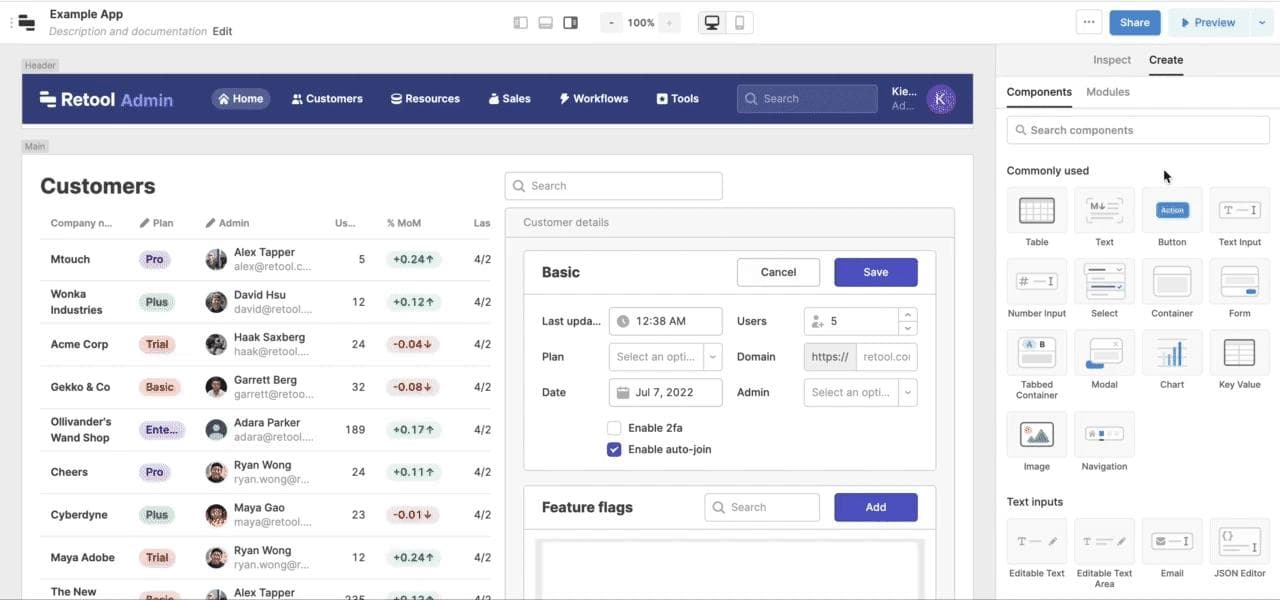
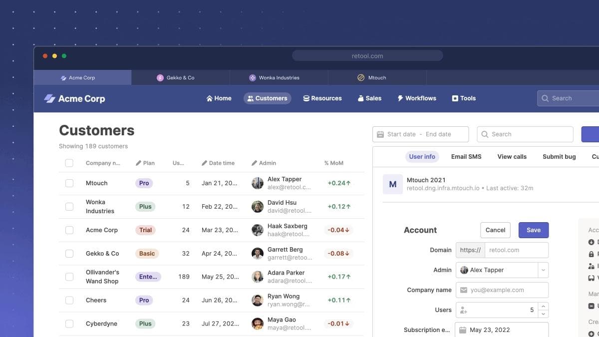
Retool helps developers build internal tools. To make the experience as fast as possible, we offer a library of tables, charts, forms, buttons inputs, and other production-ready UI components that you can quickly assemble into any interface.
From 2017 to 2021, this component library was built on top of Ant Design, one of the most popular React UI libraries. But as our customers and company scaled, this decision presented limitations: we were building increasingly brittle hacks and maintaining hundreds of manual overrides in our codebase to offer better customization or functionality on Ant’s baselines.
Even so, we’re incredibly grateful for Ant. We wouldn’t be where we are without their framework. We simply hit a scale and complexity where it was time to build our own.
Today, we’re excited to announce a new library of 90+ UI components—all tailored and optimized for internal tools and business apps.
Over the past year, our team has rearchitected our original components and added 35+ brand new ones––giving you 90+ UI blocks optimized for the small details that matter the most for internal tools.
Our updated library includes:
- Support for new UI patterns in Retool with added components like Statistic, Range Slider, Currency, Listbox, Collapsible Container, and more
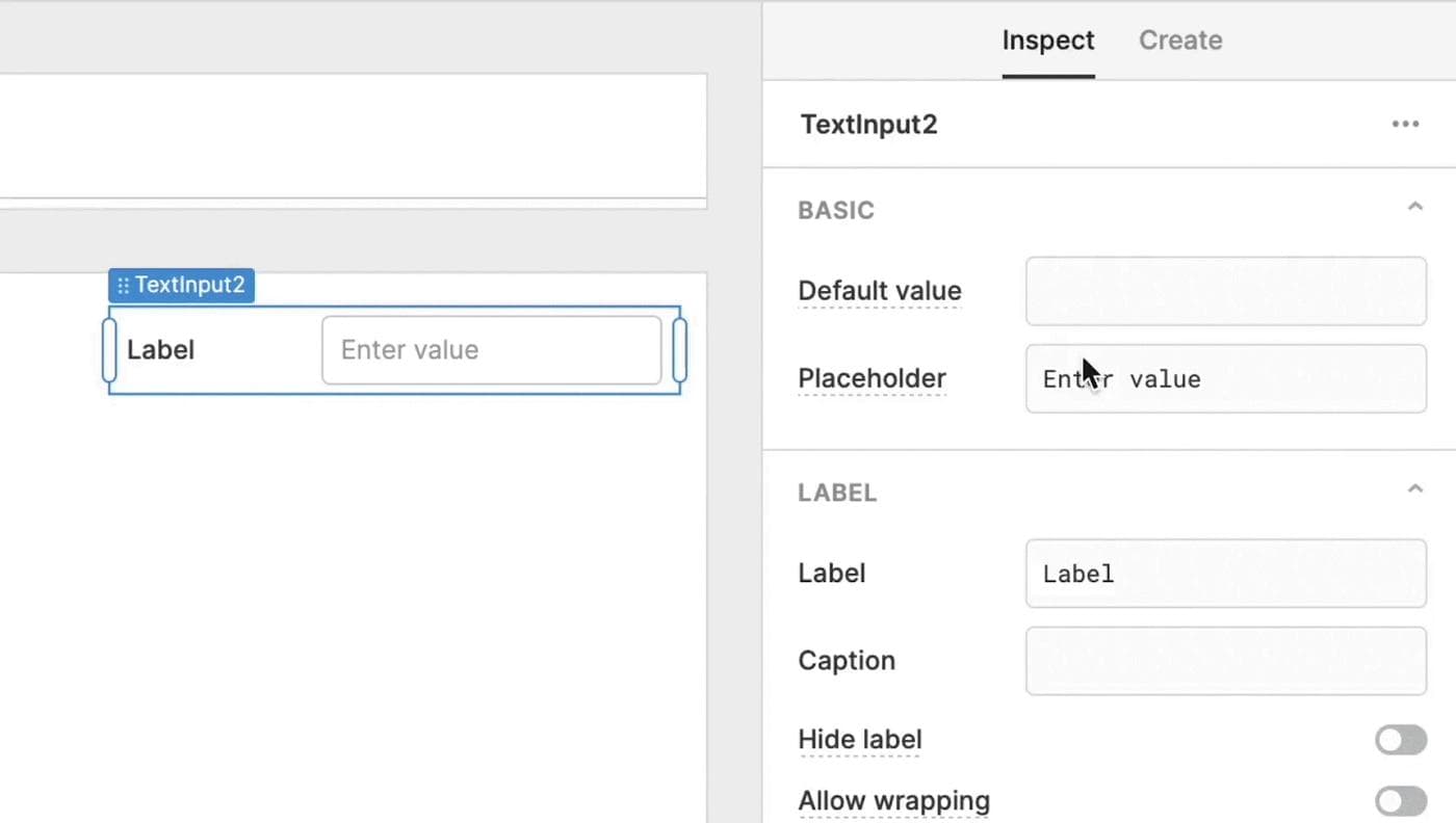
- 40+ input options with pre-configured validation and dynamic row height for better data density and faster user interaction
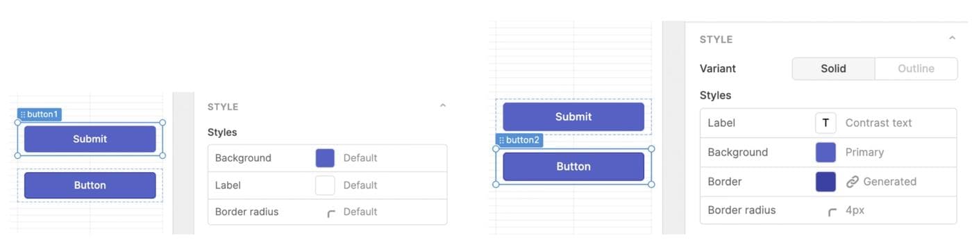
- Presets and variants preconfigured with formatting and validation for common use cases like URL, Email, and Currency, and the ability to switch between common components in one click
- Over 3,400 icon options to help quickly customize your internal UIs
- 20+ column types for tables—with options to customize border visibility, dynamic row height, and conditional cell, column, and row colors
- Expanded component directory to see configuration examples and expanded API docs on properties, methods, and events for each component
- And tons more!
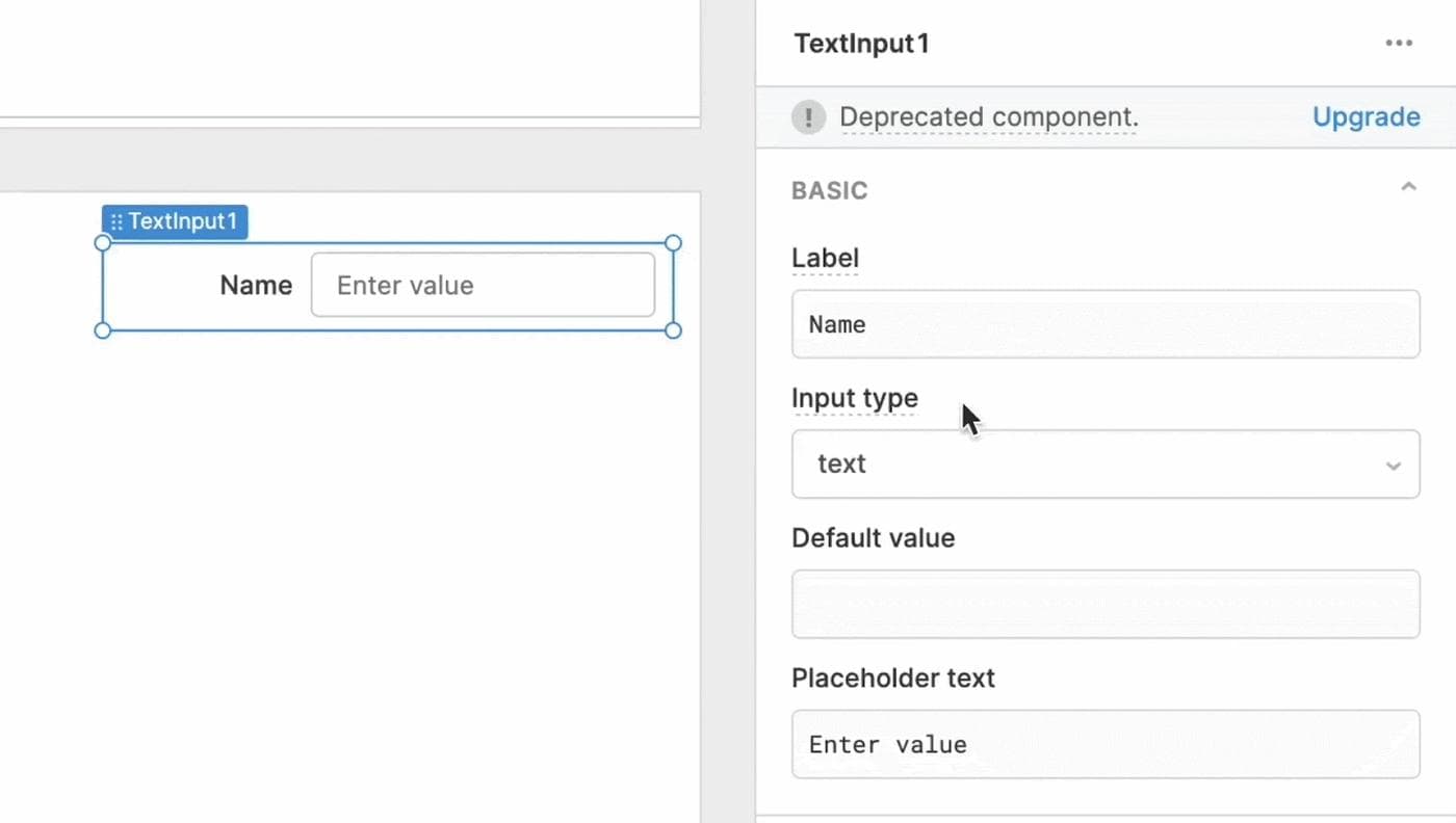
These updated components are available now in the Inspector when building new apps, with outdated components located in the “deprecated components” section. Existing users can manually upgrade any deprecated component in an existing app with our one-click upgrade option.
This is still Day 1 for our component library, and we’re adding more components each day. We’re working to expand style editing, including more control over visual details of each component like typography, spacing, borders, and elevation. We also know customers want more options for navigation components, like breadcrumbs and sidebars.
Customers exploring new use cases—like emergency AED locators or tournament-style coding font games—are what pushed us to make our UI toolkit more powerful, and we’re excited to continue supporting them with even more updates in the future.
Head to our docs to check out the new library in full, or start building in Retool for free today.
Reader
