
Every authoring tool comes with an interface to help users customize objects. In React, you'd reference API docs to find and modify relevant component properties. In a visual tool, there's usually a panel that lets you scan, add, and modify properties based on your current selection. Almost inevitably, these visual inspectors grow more complex over time and eventually become cluttered and overwhelming—and users find themselves forced to memorize the locations of properties and juggle multiple UI panels.
We've experienced this “clutter creep” firsthand at Retool. While our product started off quite simple—with a few components and minimal customizations—we've since built a rich component library containing a multitude of properties and configuration options. As we added more and more components, it got harder and harder for users to cut through the clutter and find common customizations.
Over time, adding configuration options without a consistent way to categorize them also resulted in an Inspector with too many disparate property groups. Rather than defining a few grouping concepts and applying them uniformly, we ended up with many concepts, each applied inconsistently. This made it difficult for users to build a clear mental model around which properties lived in which sections. Our users needed a simple and predictable way to find component properties—so we've redesigned the Retool Inspector to reduce clutter and build a foundation for consistency.
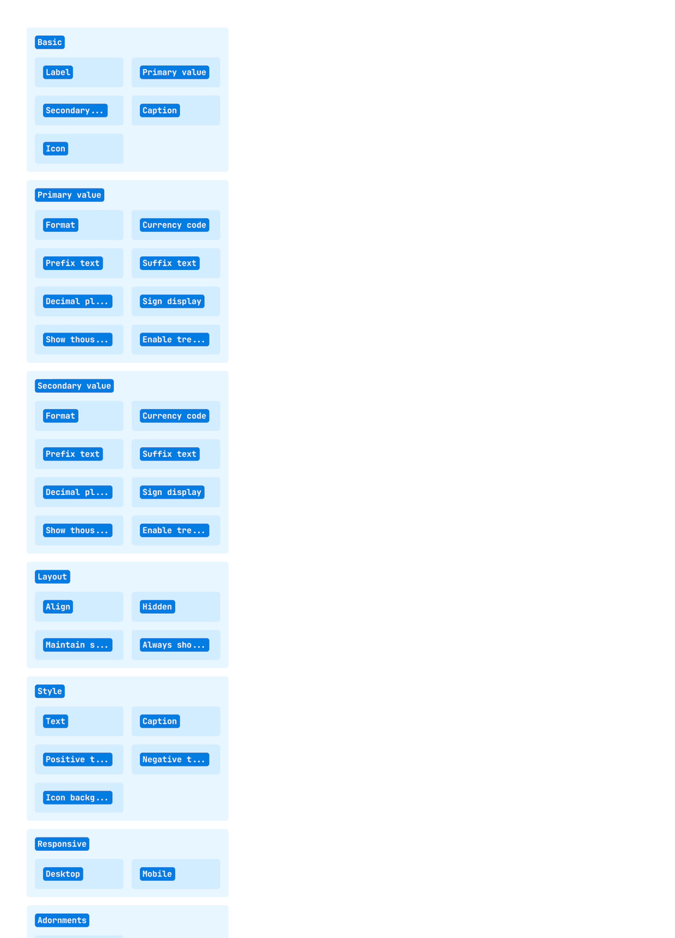
In order to make finding properties more predictable, we had to tackle a big challenge: improving consistency around property grouping. After auditing our component library, we found that we were using 40 different property sections across our 100+ components. The sheer number of sections was difficult to grok, and required users to constantly add new concepts to their mental model of Retool as they worked with new components.
Moreover, we were using grouping concepts inconsistently. Before the redesign, each section fell into one of three grouping concepts in our Inspector: basic-advanced grouping, effect-based grouping, and subcomponent grouping.
- Basic-advanced grouping involved grouping properties based on frequency of use
- Effect-based grouping involved grouping properties based on the effect they had on the component (interaction, layout, style, responsive behavior, etc.)
- Subcomponent grouping involved grouping properties based on the specific part of a component: all label-related properties, for example, would be bundled together regardless of effect or frequency of use.
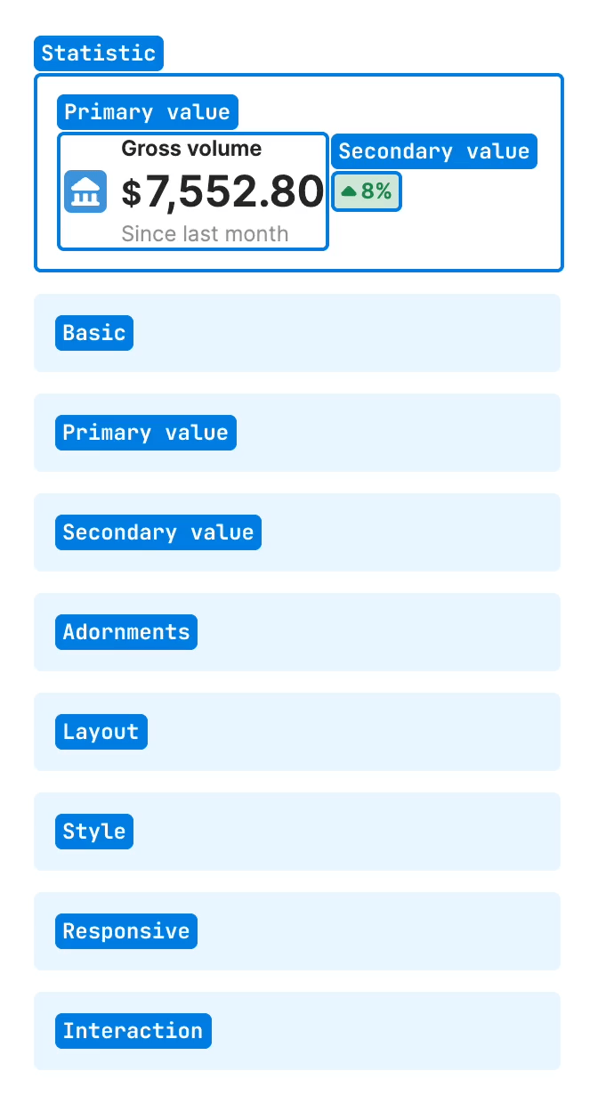
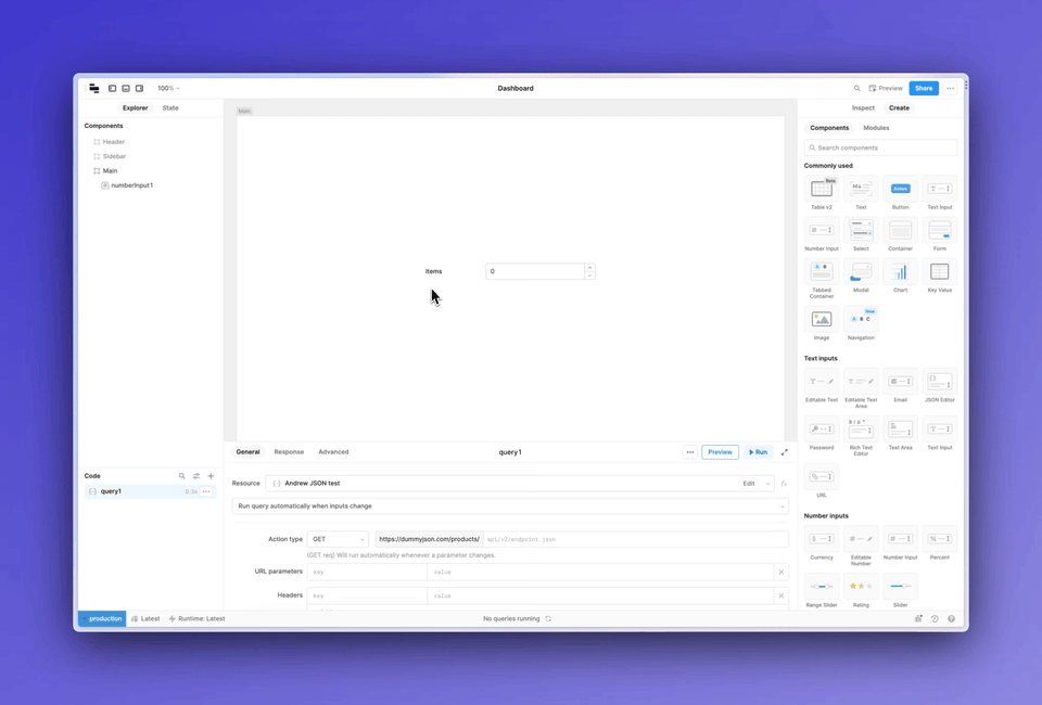
Because we were applying all three grouping concepts simultaneously, the categories in the Inspector weren’t mutually exclusive. Depending on the grouping concept you were using, a given property might appear in multiple categories, and in different places. For instance, trying to do something as simple as modifying the icon in a Statistic component was quite difficult: the icon property could reasonably be placed in the Basic, Primary Value, or Adornments section.
To solve these problems, we introduced two changes. First, we consolidated the number of effect-based categories from 40 to 3: Content, Interaction, and Appearance.
- Content contains properties that control data and text being piped into the component (Value, Data, Placeholder text.)
- Interaction contains properties that impact the behavior of the component (Event handlers, Validation rules, User selection.)
- Appearance contains properties that change the look of a component (Styles, Layout, Responsive behavior.)
Second, we decided to apply property grouping concepts sequentially rather than in parallel. That meant we’d no longer use subcomponent groupings for some properties and effect-based groupings for others. Instead, we’d choose either subcomponent, effect-based, or basic-advanced and apply it consistently across all properties. After we picked that primary grouping mechanism, we could layer other grouping concepts on top.
We explored three high-level solutions: grouping first by basic-advanced, grouping first by effect-based, and grouping first by subcomponent.
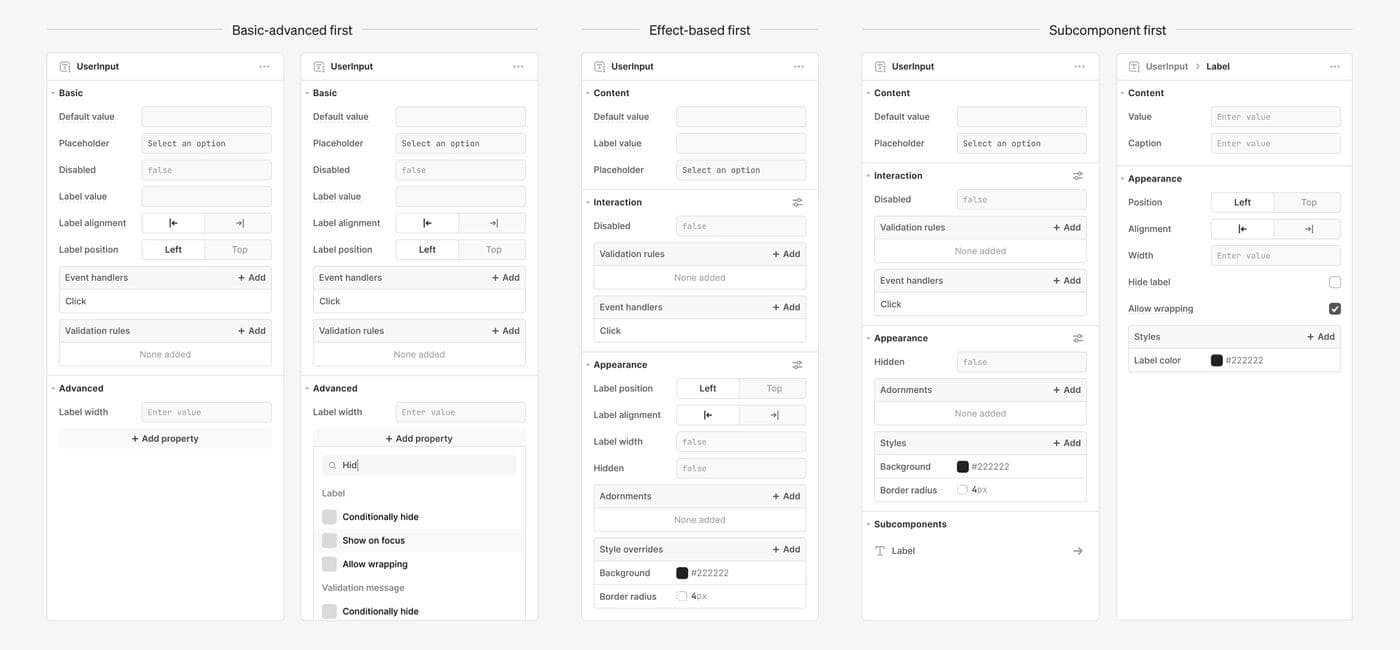
While each solution had its merits, we ultimately went with a subcomponent-first approach where users first identify the piece of the component they want to edit, then pick the appropriate effect-based section. In addition to performing the best in internal user tests, the subcomponent-first model had the benefit of further reducing clutter by keeping additional properties hidden when users didn’t have any subcomponents selected.
To help make subcomponents more discoverable, we also introduced an on-canvas clicking interaction that would enable users to navigate directly to commonly used properties like Label values.
Alternative directions came with suboptimal tradeoffs: splitting everything into effect-based categories, for example, made common workflows like editing input labels feel slow and cumbersome. Meanwhile, the primary advantage of grouping first by basic-advanced—the ability to highlight the most important properties—could be captured by layering an additional basic-advanced grouping on top of an effect-based or subcomponent-based grouping.
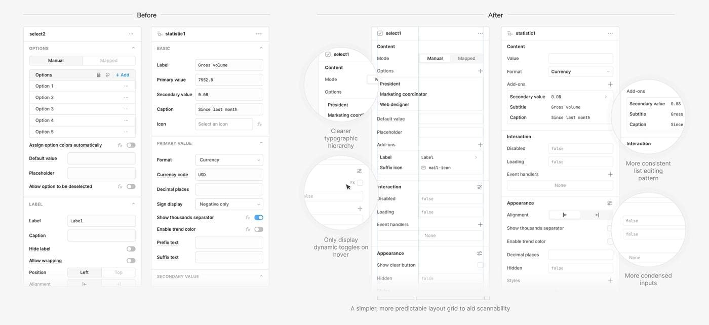
The first version of the redesign grouped properties into four sections: Content, Interaction, Appearance, and Subcomponents. After testing a prototype with customers, we found that users could be confused by the relationship between subcomponents like Label and nested components like Tabs inside of a Container. Moreover, we got feedback from internal builders that it could be difficult to tell when something was a subcomponent versus an adornment. (Tooltips, for example, are adornments, while Labels are subcomponents.)
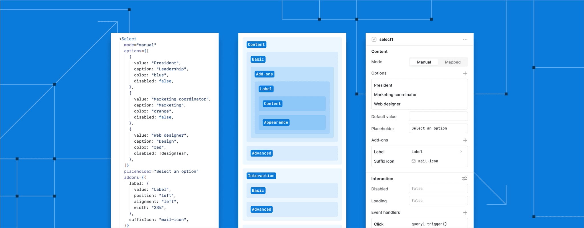
To address this problem, we combined adornments and subcomponents into a new section called “Add-ons,” and moved them into the Content section of the Inspector. By pushing for fewer concepts applied uniformly, we were able to resolve the conceptual murkiness around subcomponents, nested components, and adornments while improving the discoverability of important add-ons like Label.
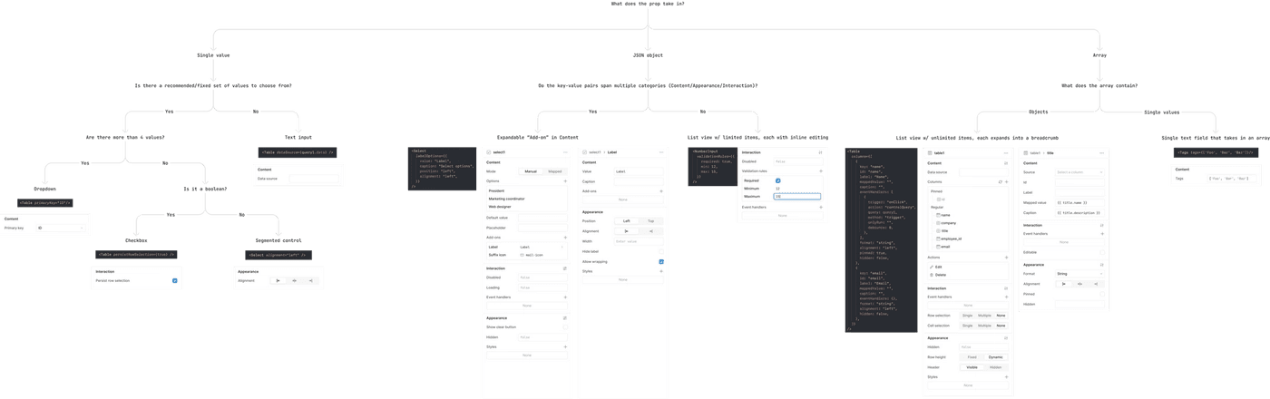
Finally, we needed a grouping system that would scale consistently as we added more component properties. To provide guidance on where to surface new properties in the Inspector, we created a flowchart that would allow any Retool engineer to represent component properties in code as Inspector UI. With the right API design, the diagram should make surfacing component properties in the Inspector an afterthought—by moving through the flowchart, anyone can group and represent properties in a manner consistent with the rest of the Inspector.
Even with more consistent property grouping, the inspector could still feel overwhelming, especially for new users. The second part of the redesign involved introducing a new set of progressive disclosure patterns and visual changes to further reduce clutter and help users focus on important properties.
First, we designed a new list editing pattern, which allows users to progressively add options to a list of key-value pairs instead of displaying everything at once. This pattern enables users to focus on properties they’ve chosen to edit and skip over customizations that aren’t important for their use case. We’ve applied this pattern across three property types: Add-ons, Validation rules, and Styles.
Second, we added a toggleable advanced panel for each section. After digging into user data around component usage, we found that a good chunk of advanced component properties were used infrequently. To prioritize commonly used properties and reduce clutter, we moved the less frequently used properties into the advanced panel, keeping them hidden by default.
Finally, we made typographic changes to make sections more readable, and we redesigned our UI patterns to be more compact and space-efficient. These updates—ranging from better typographic hierarchy to smaller code inputs—improve scannability and ensure that fewer properties are pushed below the fold.
We're excited to see how these changes will improve the experience of building apps for new and existing users alike. We believe that a simpler, more consistent Inspector will reduce Retool’s learning curve and help users find the properties they need more quickly. We'll continue to refine and iterate on these changes, and are hopeful that this redesign will lay the groundwork for future updates as our component library continues to evolve. Take a look—and let us know what you think!
Special thanks to Darya Verzhbinsky, Jennifer Zhang, Jessica Sun, Joshua Tang, and Maya Gao, and to Cassie Stewart, Kyle Turman, Ryan Lucas, and Sid Orlando for their editing help.
Reader

