

There are many compelling reasons to create an internal UI component library for your organization. These include: stylistic consistency across your web assets, speeding up app development time, and improving collaboration between developers and designers.
In this article, we’ll look at some of the key factors you’ll need to consider if you’re planning on creating and maintaining an effective component library, from choosing the right component library development tools and best practices like testing and documentation.
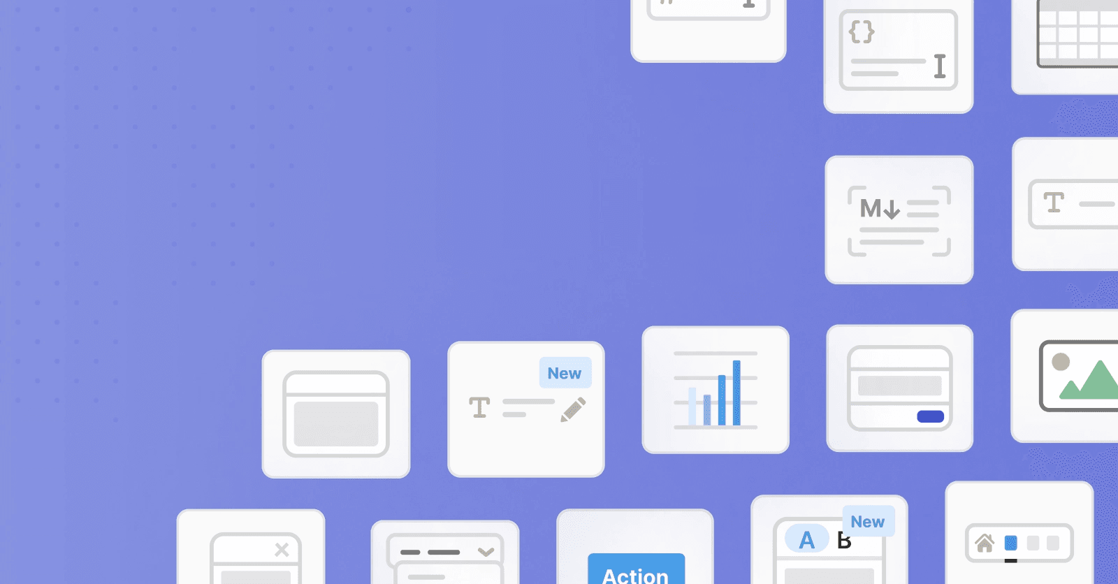
A component is a programming abstraction that breaks down a user interface into small, isolated chunks like buttons, carousels, toggles, navigation bars, etc. Like LEGO blocks, components can be mixed and matched to create apps of all sizes and complexities. This is now second nature for most developers, especially since React has taken off.
In the domain of web apps, components typically contain the three main ingredients: HTML, CSS, and JavaScript. They have defined inputs (including user actions like mouse clicks and data inputs called props) and outputs (including rendered HTML markup and browser events).
Below are some example components from the MUI framework.
Most modern web apps are built with a frontend JavaScript library. In the past, this was usually a utility library like jQuery or Lodash. Although these libraries are still used in simple sites, the most popular JavaScript libraries of today are a new generation of component-based libraries like React, Vue, Angular, and Svelte.
The simple explanation for this shift is that components make UI development far quicker and easier. The reasons for this include:
- Reusability. Developers can solve a UI problem once and then reuse the solution.
- Simplification of code. Gone are the days of massive script files. Components allow code to be abstracted in small, logical chunks.
- Easy management of application state. Components have well-defined inputs and outputs that can be leveraged in debugging.
- Testability. The inputs and outputs make them suitable for testing, providing more robust production apps.
With libraries like React, you define your HTML and JavaScript / interactivity together, instead of writing HTML and post-hoc extracting and selecting it with something JQuery. JSX has its downsides but the method of defining your HTML in JavaScript is admittedly a more natural paradigm.
Component libraries are collections of components unified with a common purpose. An example from the open-source world is MUI, which is a set of UI components including buttons, panels, alerts, etc, that implement Google’s Material Design spec.
Component libraries are popular: they’re used by organizations like Atlassian, Shopify, and American Express. Here’s a section of the design system that forms the basis of Airbnb’s component library:
Many organizations are now utilizing component-driven development as a primary UI development methodology.
In this approach, design, development, and UX work together to create a library of components from which applications can be easily composed. This provides advantages like:
- Improved collaboration between design, development, and UX.
- Faster UI development especially for new team members.
- Design and user experience consistency across all assets.
- Easy recomposition of assets during promotions, branding updates, etc.
Component libraries do take effort to get up and running and may not be the best choice for small teams since they require serious planning and maintenance.
But if done correctly, a component library allows organizations a new level of agility where projects can be bootstrapped in days, rather than months, by simply combining a handful of existing components like forms and tables.
Here are some of the traits you’ll be aiming for when developing a component library:
- Consistency. Components in the library have a consistent look and feel and work together seamlessly.
- Intuitiveness. Developers can expect common patterns and features in the library allowing them to quickly learn and deploy components.
- Clarity. Components have clear uses and are neither trivial nor monolithic. For example, NavBarMobile with ample customization options, not DarkNav3NoDropDown.
- Robustness. A library will be resistant to bugs if it’s based on quality development practices like testing and documentation.
In the rest of this article, we’ll look at some of the tools and best practices you can employ to create a great component library for your organization.
Component-based development on the web began gaining popularity around 2014. The trend was not driven by browser features, but instead by third-party JS libraries designed to overcome the common web development bottlenecks.
The first well-known component-based library was Facebook’s React, which allows developers to define their components as simple JavaScript functions:

While React continues to be the most popular such library, there are now several popular options including Vue, Angular, and Svelte. There is also now a native option in web components.
The JavaScript library you’ll use to build your components is one of the most important aspects of your component development stack.
While some organizations will do a feature comparison between component-based libraries, in reality, all of the popular frameworks now offer excellent levels of performance and stability and have evolved to offer roughly equivalent features.
For this reason, your best bet will likely be to choose the framework that your team is already most comfortable with.
Components were not initially native to the web, but that’s changing with web components that promise a neutral, framework-agnostic option.
While browsers have been implementing the web components standards for several years now, they are still far from being the most popular choice, as they don’t yet have the ecosystem and mindshare of libraries like React and Vue.
Progress on web components continues, however, and new web-component first libraries like Lit make web components a viable, future-proof option for your component library.
On the other side of the office are your designers and UX specialists who play a role in component library design that is of equal importance to that of developers.
The precursor to a component library is a design system which is a set of codified design and UX rules and choices that guide the creation of your component library. Creating a design system will improve collaboration between designers and developers and ensure consistency in your components, especially from a visual standpoint.
A design system will declare design “tokens” to be common across components (colors, typography, etc), sketches of the components themselves, as well as patterns for combining components into pages.
Early adopters of component-driven development discovered the fact that creating, documenting, distributing, and testing component libraries can be a challenge.
For this reason, component development tools like Storybook have arisen which provide a streamlined way of developing and maintaining component libraries.
Storybook’s main feature is that it allows the development of individual components in isolation of any app. Each component is given a page where it is mounted and displayed and can include interactive parameters that users can change and see the effects, for example, different colors or sizes.
Other features of Storybook include:
- Support of key JavaScript libraries including React, Vue, Svelte, and web components.
- Can act as a component documentation site and style guide.
- Out-of-the-box visual and snapshot testing.
One of the key advantages of components is that they can be used and reused. For example, you can use the same NavBar component across every new project to not only save time but also reduce the amount of code you have to write.
The flip side of this is that component code must be reliable. For this reason, it’s a good idea to be developing tests for your components (although this is also true for the rest of your app).
There are several types of tests that are popular for components including unit tests, snapshot tests, and visual tests. These can be used alone or in combination.
A unit test allows testing of a component in isolation by supplying it with test inputs (e.g. mocked user interactions or props) and asserting specific outputs (e.g. events or rendered markup).
For example, a to-do list component could be tested by asserting that two added tasks results in the rendering of two list items.
1 2 3 4 5 6 7import { mount } from '@cypress/react' import TodoList from './components/TodoList' describe('TodoList', () => { it('renders the todo list', () => { mount() cy.get('[data-testid=todo-list]').should('exist') }) it('contains the correct number of todos', () => { const todos = [ { text: 'Buy milk', id: 1 }, { text: 'Learn Component Testing', id: 2 }, ] mount() cy.get('[data-testid=todos]').should('have.length', todos.length) }) })
While it can be time-consuming to write unit tests, they’re thorough and fast to run.
Also, by utilizing a build pipeline like CircleCI or GitHub Actions, you can run your unit tests automatically whenever a developer attempts to add to the repository. This provides an extra layer of quality assurance.
Snapshot tests compare the rendered markup of a component against a known baseline. This ensures that unexpected changes will trigger a warning or error.
This method is good for picking up on unexpected side effects that occur due to a shared dependency change. While you could use unit tests for this, snapshot tests are much quicker to write.
One of the advantages of using Storybook is that it provides snapshots by default. Other tools like Jest can also provide snapshot testing with minimal setup.
If you’re short on time, the most simple means of testing is visual testing, where you simply visually inspect your components to ensure they look and function how you expect.
This is made easy when you use documentation tools like those discussed below, or component development environments like Storybook.
While often thought of last, an essential part of a great component library is a documentation site. This site allows developers to easily look up a component and know how it works and how to use it.
Both of these frameworks are especially effective for component libraries due to their support of markdown and more specifically MDX. MDX allows developers to import and use components directly in a web page.
Docz documentation framework
Documentation is useful for all of your team’s developers but is especially useful for onboarding new team members and contractors.
Component libraries and component-driven development offer a flexible and robust approach to building modern web apps. While already popular, native browser support through web components suggests this will be an industry-standard moving forward.
Rather than building your own web apps, you can try Retool. We give you a drag-and-drop interface, integration with a variety of backend services, pre-built UI components, single sign-on support, and a lot more.
If you want to make it really easy, start from one of our many templates, or check out our YouTube channel for some quick and easy admin panel tutorials.
light Reader

