
If you’ve ever had to wrangle a maze of marketing, sales, and BI tools—just to end up plugging it all into a spreadsheet—this article is for you.
We’ll go over the three core dashboards we built for all marketing and full-funnel metrics, why we chose to build our own, and how our marketing lead Kevin White (formerly of Segment, HackerOne and MemSQL) uses them.
With a background in marketing ops and driving demand, Kevin has had a front row view of how marketing tech stacks and data pipelines have evolved and expanded over the last decade.
What's most surprising? Most companies still struggle with a simple problem: aggregating, viewing, and acting on different data sources.
While the problem in the past may have been that the tools were not powerful enough or the data you needed didn’t exist, today we face a different issue: there are too many tools at your discretion. Your data sits in an endless assortment of ad platforms, marketing automation platforms, CRMs, payment processors, and data warehouses that are all good at a specific job—but leave you struggling to get a cohesive, comprehensive picture from 10 open tabs.
Retool solves this nicely, as we can pull in data from data warehouses, Stripe, Salesforce, Google Ads,Segment—really anything with an API—to build an interface custom to your business. And, much like great tools in the vein of Mixpanel or Amplitude, we make it pretty easy for everyone to have canonical company dashboards and replicate/customize them for their own needs.
What is unique about Retool, then? We treat analytics like a product: rather than a static view/dashboard, our marketing team has a veritable app to play with.
For example, for a product launch, we can use Retool like a BI tool to drill into the metrics—but also use it as a sign-up tracker, a goal-oriented dashboard, and a workflow manager (e.g., "when metric X hits Y, do this").
This also means we don’t have to limit ourselves to the structures defined by a BI tool. If anyone on the team wants to add a button, a workflow, or a deep-dive modal, Retool’s ability to say "Yes!" to deep and fast customization is what makes a difference when it comes to acting on the data.
Last but not the least: at Retool, we like drinking our own champagne. The more we use our own product, the better it gets, the more confidently we can speak about it, and the better we can market it.
If you are wondering what a marketing dashboard should include, our main Retool marketing dashboard is a good start. Kevin’s goal was to have both a bird’s eye view of key marketing data so he can easily spot trends, and the ability to drill down into different data vectors over different time periods.
Kevin looks at this dash daily: it contains our core metrics, including those we use for reporting to the company and the board.
The dashboard essentially looks at different parts of the marketing funnel: leads, MQLs, and sign-ups.
Let’s zero in a bit.
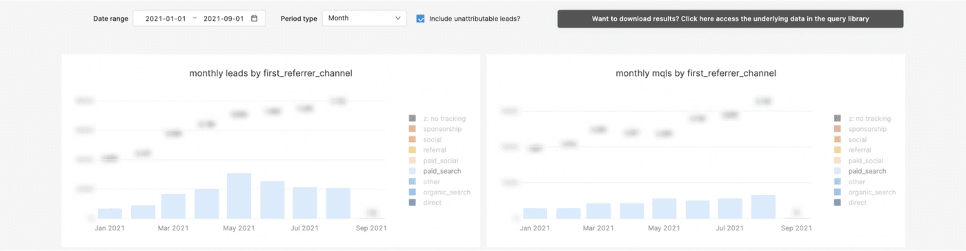
The top two charts look at leads and MQLs by channel. You can set a date range, and cohort the data by different time period types (date, month, year). The charts are interactive: you can hover over any bar area to see actual numbers and your selected date range, and drill into any channel by checking the menu box on the right.
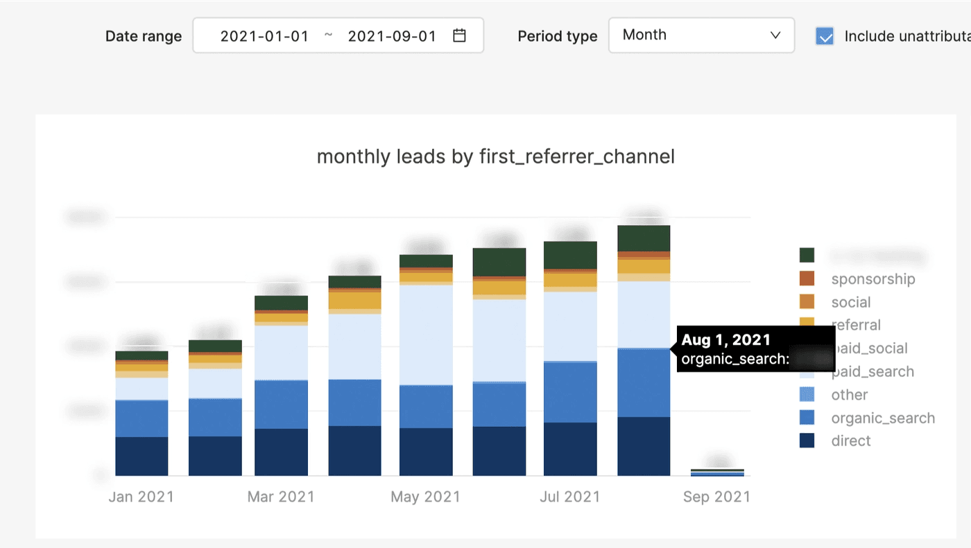
Having leads and MQLs chart side-by-side allows for a quick glance into conversion rate trends, both by channel and by time period:
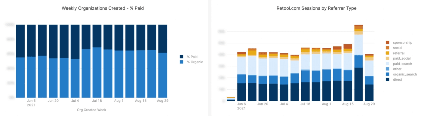
The next two charts provide a look into:
- The composition of paid vs. organic leads, and
- Traffic sessions by source type
This allows us to not only understand key metrics at a glance, but also correlate traffic (chart on the right) with leads (chart on the left).
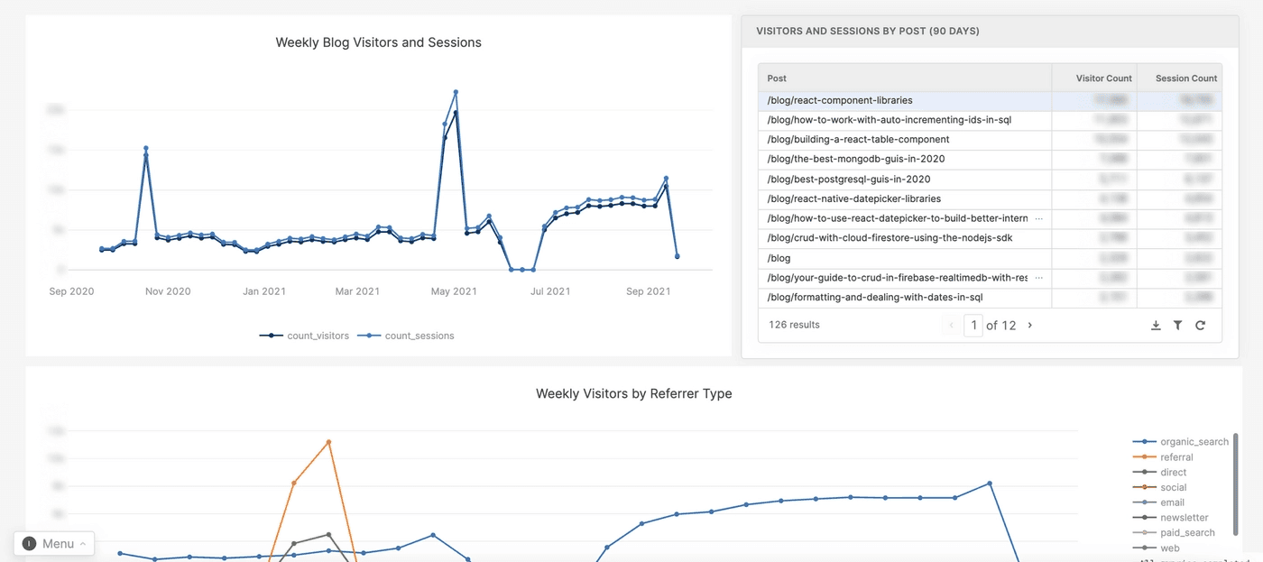
While charts are useful for quick observation of trends, the three tables on our main marketing dashboard are focused on tracking the full marketing funnel, from visit to sign-up. In the first table, Kevin can see how weekly cohorts are converting:
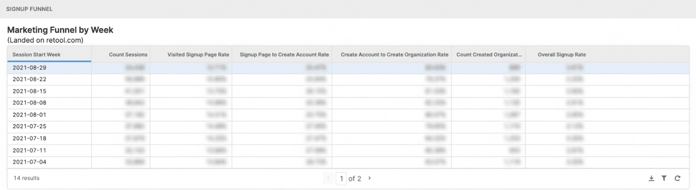
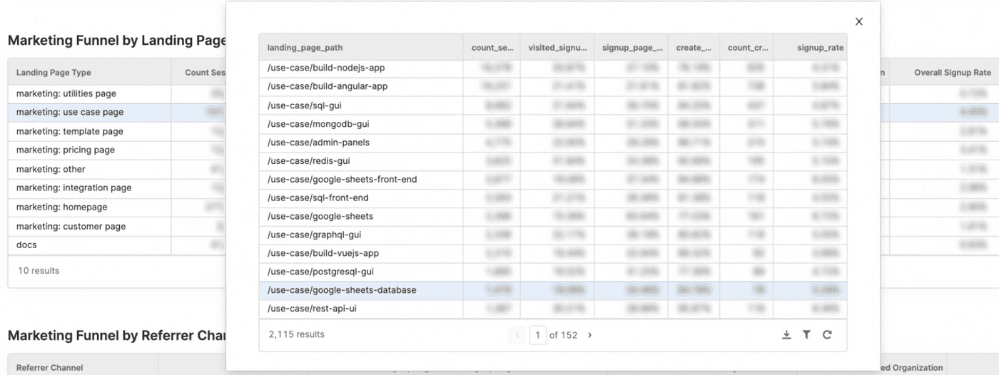
Next come two tables for analyzing the marketing funnel by landing page and referrer channel. The beautiful thing about these charts? You can drill down into each individual row. For example, seeing how each use case page is performing—from traffic to sign-up page visits, to converting from sign-up page to actual signup—is super useful, and not just for the marketing team.
Google Search Console is a powerful tool, but it is somewhat lacking in data visualization. Jane Kelly, our head of growth, put together a dashboard that augments Google Search Console with some neat new views and visualizations.
The top part of the dashboard is a customizable chart for comparing different datasets: in our case, Kevin uses Dataset 1 to represent branded search (light blue), and Dataset 2 the non-branded (dark blue). Again, you can aggregate data by any time period. The chart also includes drop-down filters for page, country, and device.
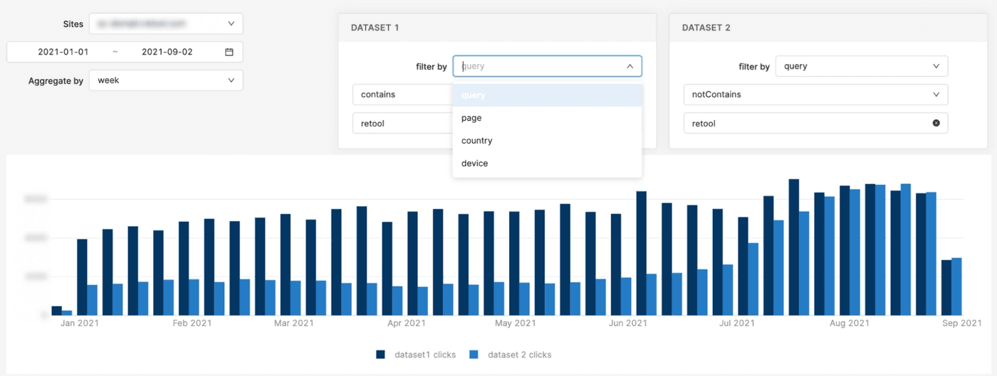
In our case, the chart shows at a glance that our investments in non-branded organic search terms are starting to pay off.
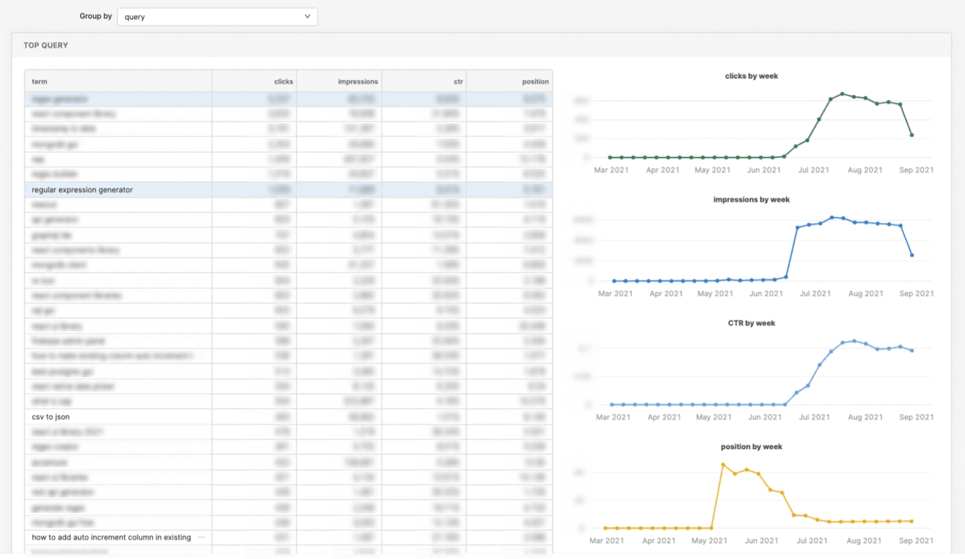
Below this chart we put together a query (search term) table accompanied by a visualization that helps us see when a certain search term starts picking up in impressions, clicks, and the CTR rate—and when its overall position improves.
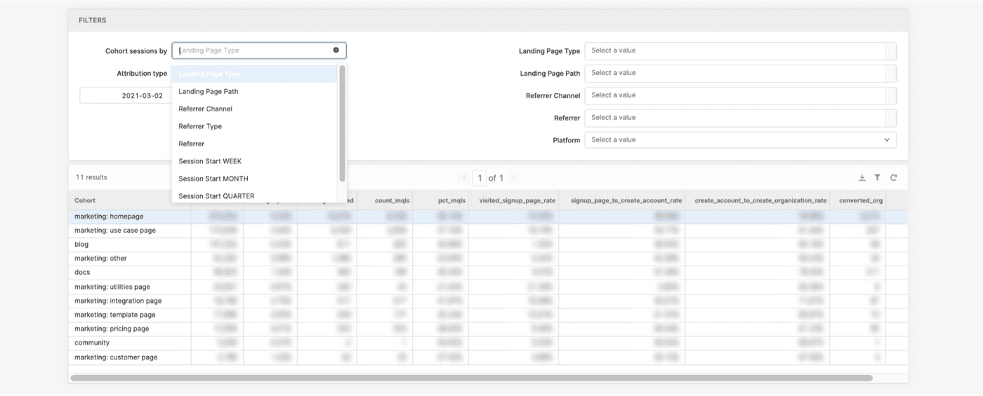
Kevin visits this Retool dashboard for insights into our full self-serve funnel by different vectors. It gives him the ability to, for example, show how pages with different landing page types and paths are converting visitors beyond sign-ups: to paid users, actions taken within the app, etc.
Once again, the ability to drill into full-funnel performance by channel is key.
Just as we were writing this article, our head of growth Jane Kelly pinged us with an update:
What’s next will not just be driven by marketing “end-user” demand, but also produced in a self-serve fashion, with team members frequently creating their own apps, such as this content dashboard:
The idea, then, is not that Retool is the be-all-end-all tool for your marketing analytics, but that treating your analytics as an ever-changing, nimble product, rather than a static dashboard, has significant advantages.
Reader