
There’s a growing expectation that data should inform every move a company makes. While technology is making this more possible—data volumes are up, cost to store and query data is down—it’s still a challenge for many teams to truly be data-driven.
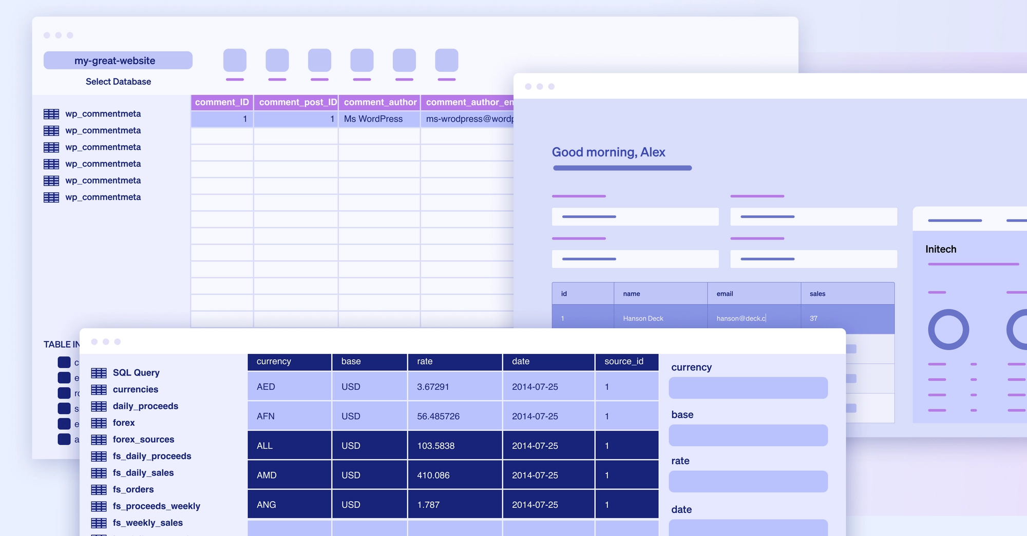
One easy way to make sense of large data sets is data visualization. Visual representations (think charts, graphs, and maps) make data easier to scan and consume, helping teams find patterns and insights they might otherwise miss. But few teams are equipped to build custom visualizations quickly, let alone maintain or improve them over time.
Even when built, visualizations are often not responsive to team needs and live separately from where the team actually operates day to day. As a result, developers and analysts spend valuable time building dashboards that are rarely opened and maintaining logic the team hardly uses.
We think there’s a better way to work, where insights and actions can exist where the team operates. Today, we’re excited to announce our new chart component is generally available for all customers. Now you can bring custom and interactive visualizations to every Retool app.
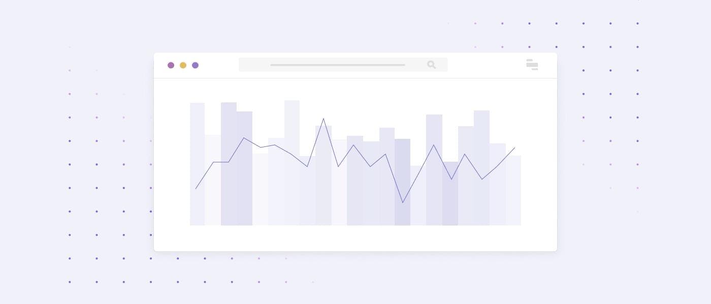
Our chart component makes data visualizations easier to build, update, and consume. For app builders, it’s simple to build charts right out of the box with all of the basics—like mixed chart types, built-in aggregations, and support for grouping—included. And because you’re building charts in Retool, you can take action on the data you’re looking at by easily writing back to your database, making an API request, or whatever else is impactful.
Retool’s chart component is powered by the open source Plotly library, so developers can build complex visualizations using Plotly’s JSON schema format. With Plotly’s connection to the data science community, we’re excited to power our component using their library and give users the ability to port existing visualizations without learning a new syntax.
For Retool end users, the chart component makes discovery interactive. Users can click through charts to deeper insights and use them within any workflow in Retool.
Looking for some inspiration? Let’s break down 3 common visualization use cases for Retool.
Since introducing the chart component in beta, we’ve seen many customers plot aggregations over time to get beyond dense data sets, quickly drill into outliers, and act fast.
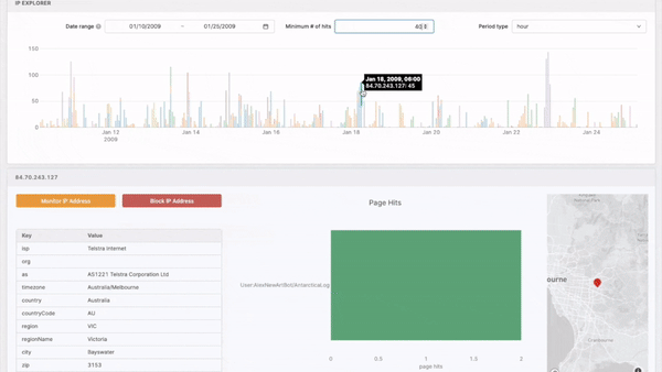
One internet security customer uses a Retool app to manage spam threats. When an email is marked for review, they plot the email metadata against IP address and other metadata to help their security team discover anomalous segments and update screening rules.
An ad agency created a Retool app to boost trending campaigns. The app charts top campaigns together, allowing a user to drill into each campaign to see the best performing creative and (directly in Retool) download, boost, or cross post the creative everywhere, tying analysis and action together.
Filter, transform or update your app by referencing the chart.selectedPoints array property in any component, query, or JS function. In the example above, we’re populating the modal table with records fetched via:
1SELECT *
2FROM big_query.customer_table
3WHERE date IN UNNEST( {{chart.selectedPoints.map(d => d.x) }})
The selectedPoints property is an array because users can drag to select multiple points on a chart.
From the outside, you might assume the hard part of data science is building models and the easy part is getting feedback. But in our experience, we’ve found many teams struggle with getting models into the hands of their stakeholders.
That’s why data science teams use Retool apps to bridge this gap by giving stakeholders a clean interface to review models and provide feedback, all structured in a way that’s useful for training.
One example is the collaboration that Sebastien Vidal, Sr. Lead Data Engineer at NBCUniversal Media, has been able to create around his ML model evaluation app built in Retool.
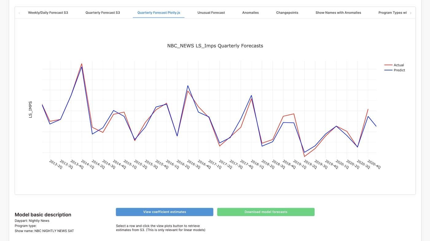
Here’s what he had to say:
Our data scientists run 800+ ML models each week, and the robust visualization options in Retool have given us a new level of visibility into model performance. At the same time, Retool has allowed us to quickly create a friendly interface to share ML models with business clients to improve our feedback loop and the feature-level suggestions clients can offer.
Plot data from multiple data sources (say Redshift and ML Flow) on the same chart using Retool’s Query JSON with SQL query type. Backed by AlaSQL, you can write a new joinData query like below and reference it as the chart’s data source.
1SELECT *
2FROM {{formatDataAsArray(redshiftQuery.data)}} AS dw
3JOIN {{mlflowQuery.data}} AS ml
4ON dw.data = ml.dateHere at Retool we build quite a few of our own internal apps in Retool (surprise!). We use Retool apps to power SDR outreach, monitor support, prioritize marketing spend, and even manage deploys.
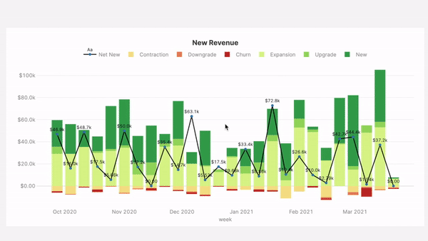
Data visualization within each of these apps makes us better at our jobs—whether that’s knowing how fast an account is growing or how our weekly metrics compare to our quarterly goals.
Last year, we decided to move all of our data dashboards from a BI platform to Retool. Why? Not only do we get to dog food our own product, we also found that moving data into the apps we were using to actually run our business meant we actually used data to inform our actions.
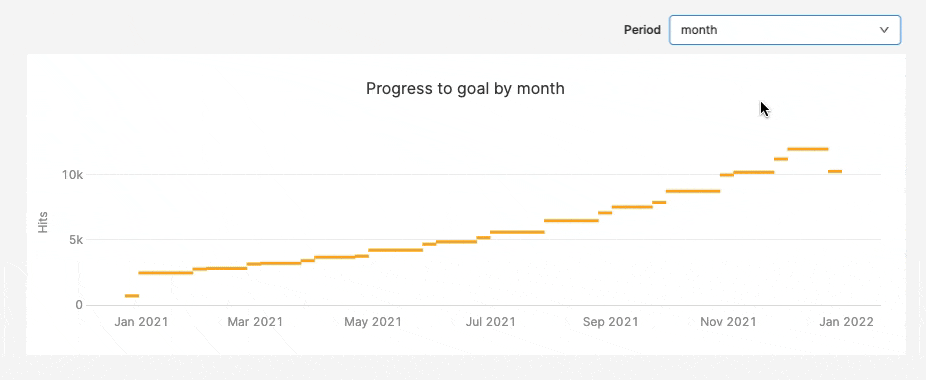
- As a company, we can now track real time progress towards goals (see above) by plotting goals from a Google Sheet against aggregations from our data warehouse.
- We can review patterns in aggregated support requests and bug reports before we push the button to release a new on-prem build.
- Our account management tool has time series activity graphs giving support and success the context they need to best help customers.
To maintain styling across charts we store common configs in transformers, and reference them using JS spread syntax (...) in the data and layout JSON for a chart.
By bringing the charts, graphs, maps as close to the action as possible, every team is better equipped to be data-driven and work fast. We’re excited to hear what data visualizations you build with the new chart component and, once you’re ready, make sure to share anything you’re proud of in our community.
To learn more about the chart component, check out our docs or login to Retool to build a chart using your own data.