
There is a new, updated version of this post here: https://retool.com/blog/react-component-libraries/
If you’re a developer without design expertise, or if you work at a company where the designers are stretched thin, it is easy to make any internal dash you are building look hideous. And no matter how great the functionality, if it looks terrible, your team won’t use it. On the flip side, you may have styled a beautiful component, but if it lacks crucial functionality — like accessibility or efficient data display — it will be useless.
Step in React component libraries. A React component library is a collection of styled React components that you can use in your React applications to save time, add functionality, increase efficiency, and make the app look great. Most React component libraries are open source, which means they’re free and (often) constantly improving. They’re generally optimized for efficiency, responsive, based on strategic design principles, and some are even optimized for mobile.
This article will list six of our favorite React component libraries in 2020, present some of their best features, and help you decide which library is the right one, based on your needs.
Each library in this list will include:
- A screenshot of some popular components in the library
- A link to the library’s GitHub along with the current (at the time of writing) number of stars
- The number of React components included in the library
- Most libraries have a number of components that include Buttons, Iconography, Typography, Layout, Navigation, Data Entry, Data Display, and Feedback/Alerts
- A list of compatible browsers
- A code snippet showing how to use the library in a React app
Ant Design: most popular on GitHub
To kick off this list, we’re starting with Ant Design, the most popular React component library on GitHub. Self-described as enterprise-level design, the Ant Design library is based on four design principles:
- Natural — users should be able to easily intuit how to interact with the design.
- Certain — designs are created with thought and purpose.
- Meaningful — every design is made with the purpose of helping the user accomplish their mission.
- Growing — designs will evolve over time to better meet the needs of the user.
These principles were established in order to help their engineering teams make quick iterations on their product while keeping in sync with design and maintaining a great UX. Extra fun fact: We use Ant icons in Retool!
- GitHub: 61k+ stars
- Components: 50+
- Compatible Browsers:
- IE/Edge
- Firefox
- Chrome
- Safari
- Opera
Below is a code sample (courtesy of the Ant Design docs) of how you would import and use Button and DatePicker components from Ant Design in a React app.
1import { Button, DatePicker } from 'antd';
2
3const App = () => (
4 <>
5   <Button type="primary">PRESS ME</Button>
6   <DatePicker placeholder="select date" />
7 </>
8);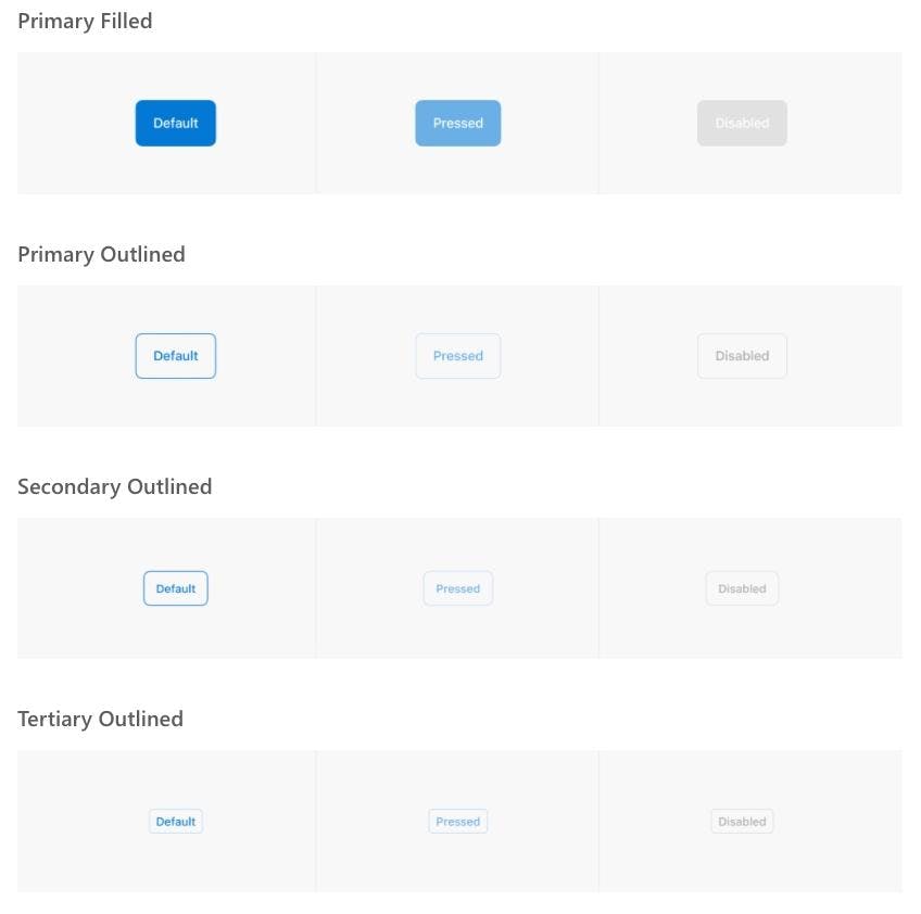
9After running the code above, your output should look something like this:
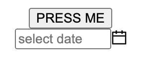
It’s not pretty, but that’s what CSS is for!
➞ Material-UI: Google design principles
Material-UI is a React component library based on Material Design, Google’s design language for user interfaces. If you like Google’s aesthetic — think cards, grid-based layouts, and responsive animations — this is the right library for your frontend.
Additionally, Material-UI components inject only the styles they need and don’t use a global style sheet (though you can use CSS modules, styled-components, or any other kind of styling you like with this library). Users of Material-UI include a lot of companies you have definitely heard of, including NASA, Netflix, and Amazon.
- GitHub: 58k+ stars
- Components: 60+
- Compatible Browsers:
- IE
- Edge
- Firefox
- Chrome
- Safari
- Googlebot
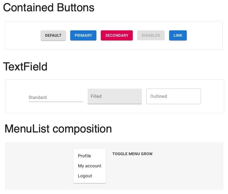
Below is a code snippet (courtesy of the Material-UI docs) of how you would import and use a Button component from Material-UI in a React app.
1import React from 'react';
2import ReactDOM from 'react-dom';
3import Button from '@material-ui/core/Button';
4
5function App() {
6 return (
7   <Button variant="contained" color="primary">
8     Hello World
9   </Button>
10 );
11}
12
13ReactDOM.render(<App />, document.querySelector('#app'));
14If you used the above code snippet correctly, you would end up with a “Hello World” button like so:

➞ Fluent UI: Microsoft design principles
If Google isn’t your aesthetic (hey, it’s not for everyone), then Fluent UI – a React component library based on Microsoft’s design principles – might be a good option. This library, formerly known as Office UI Fabric React, has all of the same components that you will recognize (and love?) from Microsoft 365 apps.
- GitHub: 8.6k+ stars
- Components: 60+
- Compatible Browsers:
- IE 11/Edge
- Chrome
- Firefox
- Safari
Below is a code snippet (courtesy of the Fluent UI docs) of how you would import and use the PrimaryButton component from Fluent UI in a React app.
1import React from 'react';
2import ReactDOM from 'react-dom';
3import { PrimaryButton } from '@fluentui/react/lib/Button';
4
5ReactDOM.render(
6   <PrimaryButton>I am a button.</PrimaryButton>,
7   document.getElementById('root')
8);
9Using the Fluent UI code snippet above generates the following component:

➞ React Virtualized: best for data
React Virtualized is one of those React component libraries that is hyper focused on doing one thing and doing that one thing really well, and that thing is large datasets. Scope is fairly narrow: there are five components in the React Visualized library, Collection, Grid, List, Masonry, and Table.
- GitHub: 19.3k+
- Components: 5
- Compatible browsers:
- All evergreen browsers
- Recent mobile browsers for iOS and Android
- IE 9+ (requires extra custom CSS)
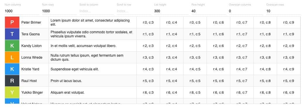
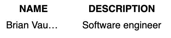
Below is a code snippet (courtesy of the React Virtualized docs) of how you would import and use Column and Table components in a React app.
1import React from 'react';
2import ReactDOM from 'react-dom';
3import {Column, Table} from 'react-virtualized';
4import 'react-virtualized/styles.css'; // only needs to be imported once
5
6// Table data as an array of objects
7const list = [
8 {name: 'Brian Vaughn', description: 'Software engineer'},
9 // And so on...
10];
11
12// Render your table
13ReactDOM.render(
14 <Table
15   width={300}
16   height={300}
17   headerHeight={20}
18   rowHeight={30}
19   rowCount={list.length}
20   rowGetter={({index}) => list[index]}>
21   <Column label="Name" dataKey="name" width={100} />
22   <Column width={200} label="Description" dataKey="description" />
23 </Table>,
24 document.getElementById('example'),
25);
26After importing and using the column and table components via the code snippet above, you would end up with an output that includes two columns--name and description--each with one value under them.
It’s not much, but it’s a start!
➞ Rebass: lightweight library
If your main goal is to get started with a simple, lightweight library, then Rebass is the right React component library for you: the entire library comes in at a mere 4KB. The seven main principles behind Rebass state that it should be:
- Minimal
- Useful
- Unopinionated
- Flexible
- Consistent
- Extensible
- Themeable
Due to this philosophy (whatever it means), the library has a small number of components included, but these components are built to be customized and extended. Plus, all components come with a basic default theme (AKA they are un-opinionated) but are easily themed (AKA themeable) because Rebass uses theme-specification, a spec for theme objects. You can build a theme using either Theme UI or Styled Theme and it will integrate seamlessly with Rebass.
- GitHub: 6.6k+ stars
- Components: 15+
- Compatible browsers: “All modern browsers that React supports”
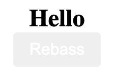
Below is a code snippet (courtesy of the Rebass docs) of how you would import and use Box, Heading, and Button components from Rebass in a React app.
1import React from 'react'
2import { Box, Heading, Button } from 'rebass'
3
4export default props =>
5 <Box>
6   <Heading>Hello</Heading>
7   <Button>Rebass</Button>
8 </Box>
9After you ran the code snippet above, you’d end up with a box that includes a heading with “Hello” and a button with “Rebass.”
➞ Grommet: accessibility features
Accessibility is a critically important but often overlooked part of creating a web app, and it’s how Grommet differentiates as a component library. Grommet is specially made with accessibility features, including keyboard navigation, screen reader tags, and native support for W3c’s WCAG 2.1 spec.
Also, the list of notable users is quite extraordinary, including companies like Uber, Netflix, Boeing, Shopify, Twilio, and even GitHub. Speaking of Github:
- GitHub: 6.4k+ stars
- Components: 60+
- Compatible browsers:
- IE11/Edge
- Chrome
- Firefox
- Safari
Below is a code snippet (courtesy of the HPE Developer blog) of how you would import and use Grommet and Heading components from Grommet in a React app. Note that is a special Grommet library component that will help with the accessibility features.
1import React from 'react';
2import { Grommet, Heading } from 'grommet'
3
4function App() {
5 return (
6   <Grommet className="App">
7     <Heading>
8       Please work!
9     </Heading>
10   </Grommet>
11 );
12
13}
14
15export default App;
16Finally, after running the code in the snippet above to import and use Grommet and Heading, you’d end up with following:

